In-app support, designed from acquisition to launch
Freshdesk acquired an in-app messaging startup called Konotor. The brief: design the full product from scratch. Agent dashboard, campaigns, FAQs, and two mobile SDKs. It reached $5M ARR faster than any Freshdesk product before it.
Agents were context-switching to do basic things.
Two steps to toggle between conversations. A Gmail-style threading model that didn't match how support actually works. No filter, no search, no user context panel. The tool made routine work feel heavier than it should.
Full product design. One designer.
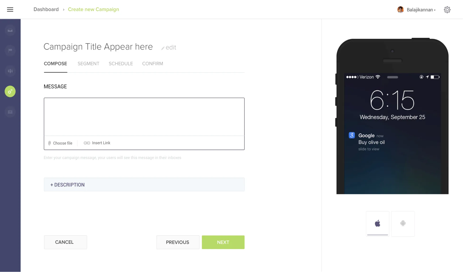
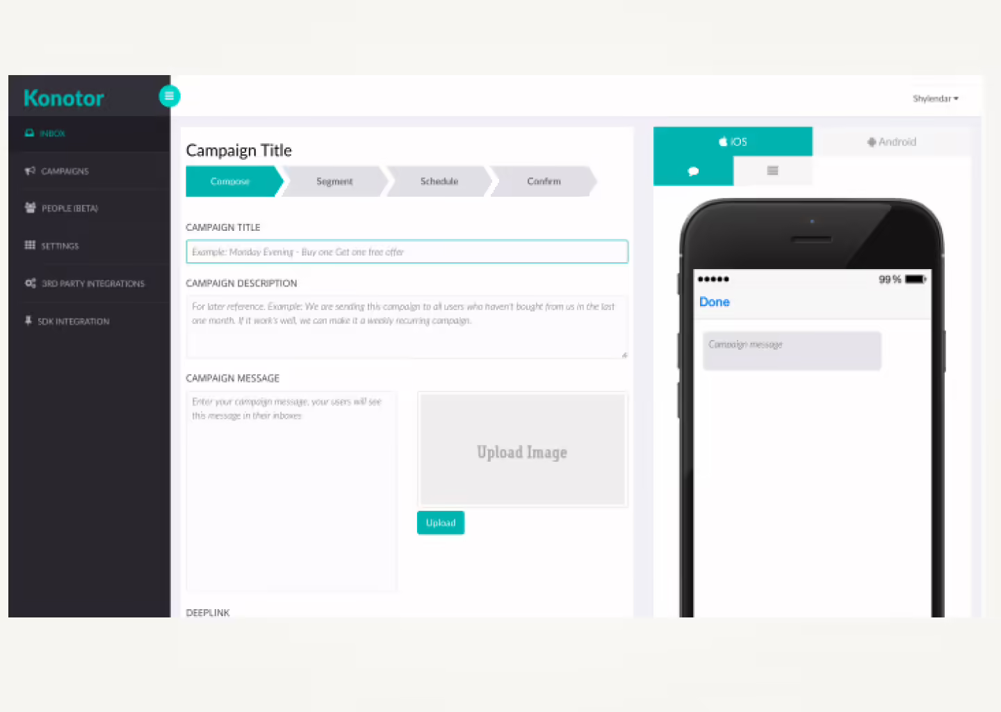
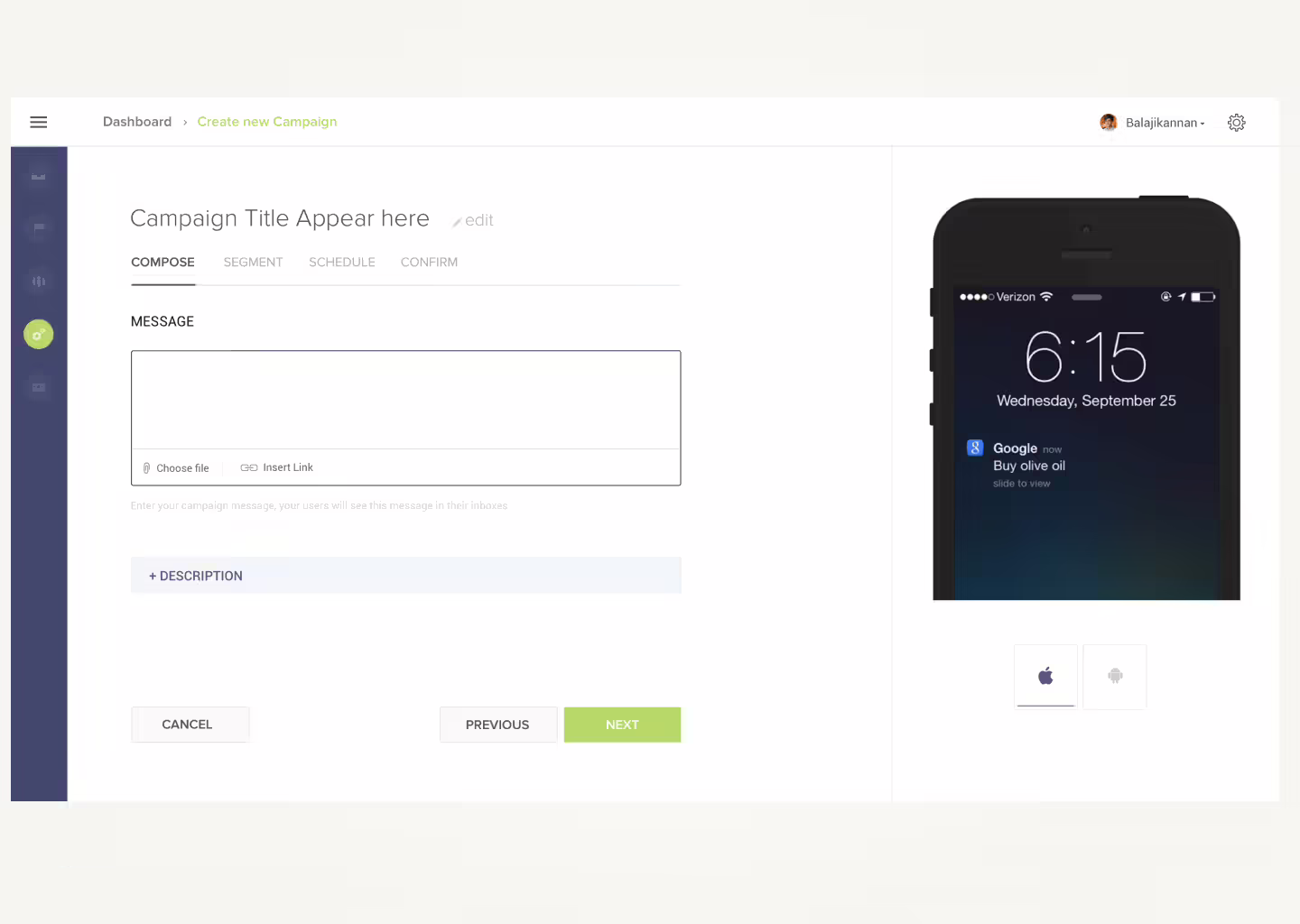
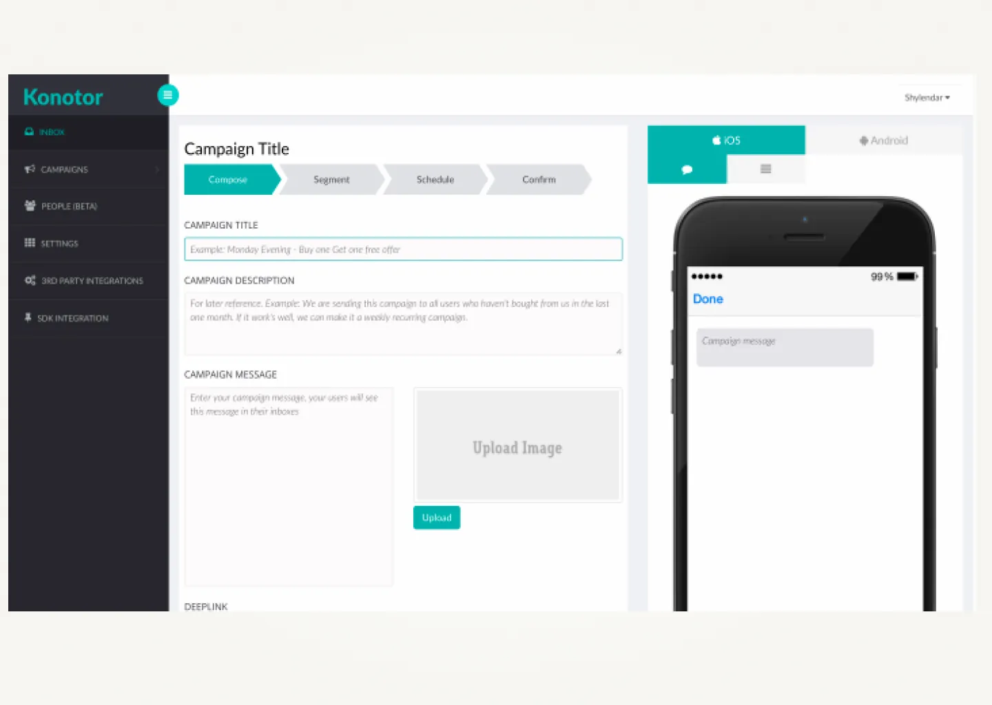
Research, interaction design, visual design, and prototyping across five surfaces simultaneously: agent dashboard, campaigns, FAQs, iOS SDK, and Android SDK, from acquisition through launch.
The fastest Freshdesk product to reach $5M ARR.
First response time dropped from 8.4 to 2.3 minutes. Average CSAT up 85%. Resolution time down 45%. Smart Plugs, a first-to-market feature, became the primary reason customers switched.
Freshdesk acquired an in-app chat product. The brief was to ship it. All of it.
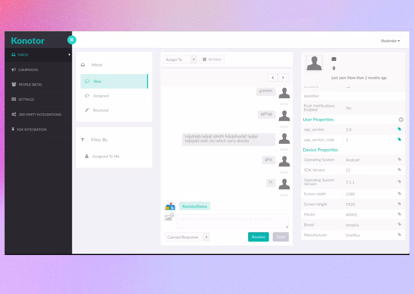
Konotor was a promising in-app messaging SDK. Freshdesk acquired it and combined it with their own mobile SDK. The design task was the full product from scratch: the agent interface, the campaign system, FAQs, and two mobile SDKs, while the engineering team was still figuring out the architecture.
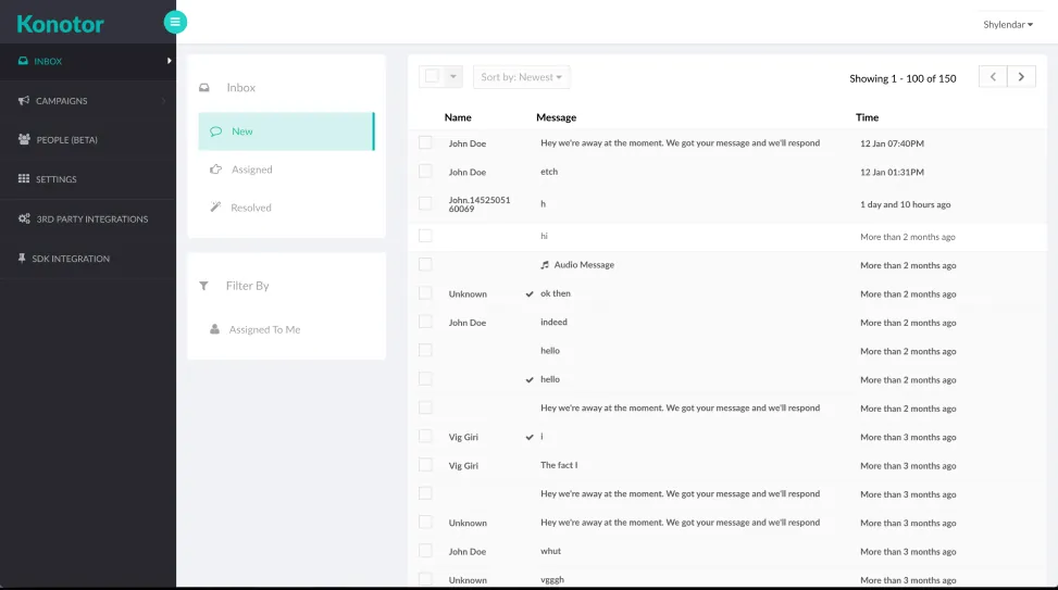
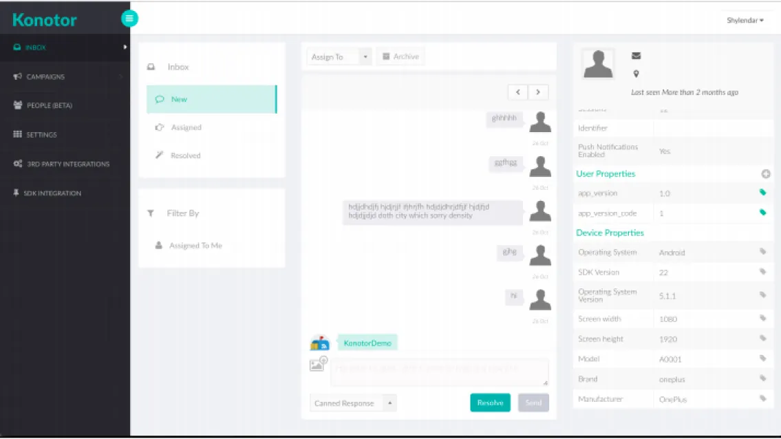
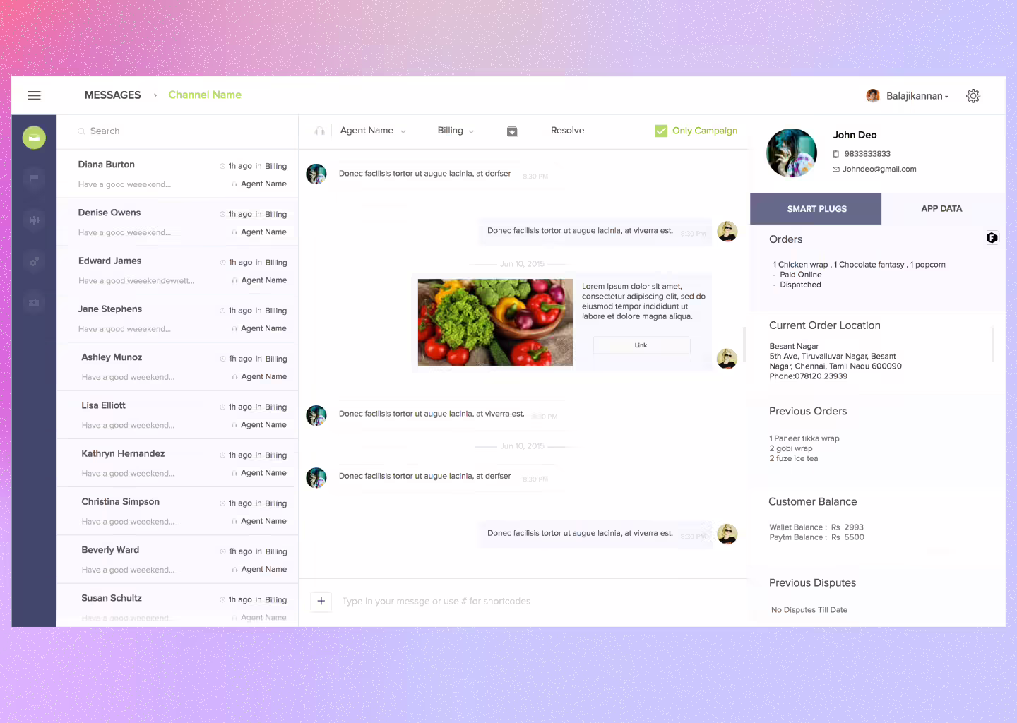
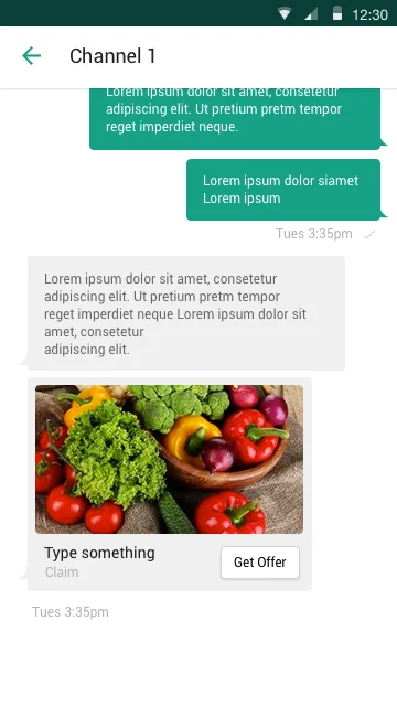
The inherited Konotor UI had the bones of a chat product, but the workflow felt like email.
Replace context-switching with toggling. Replace loading with presence.
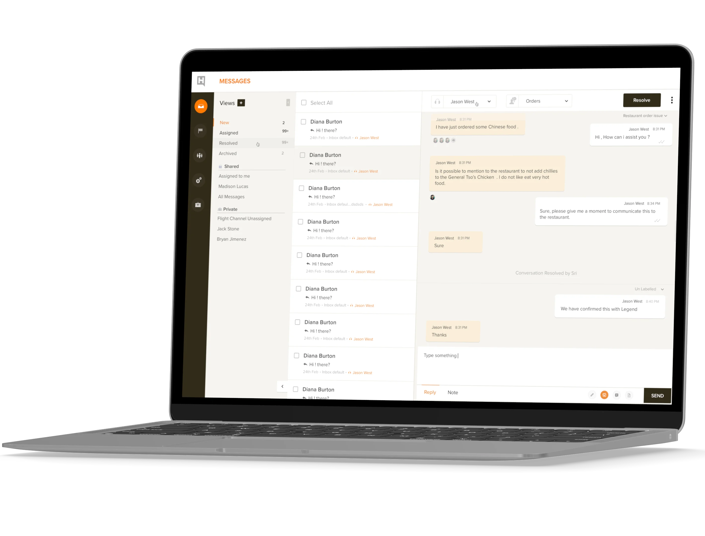
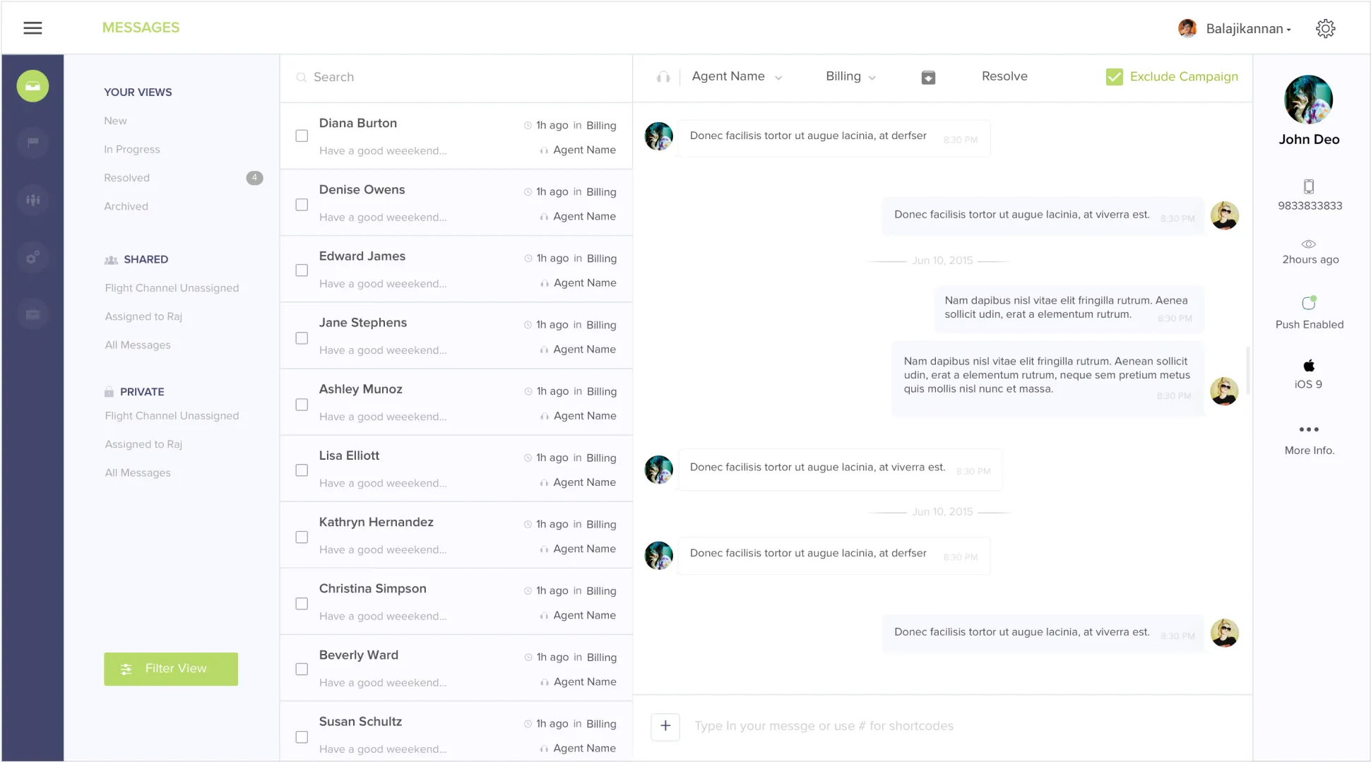
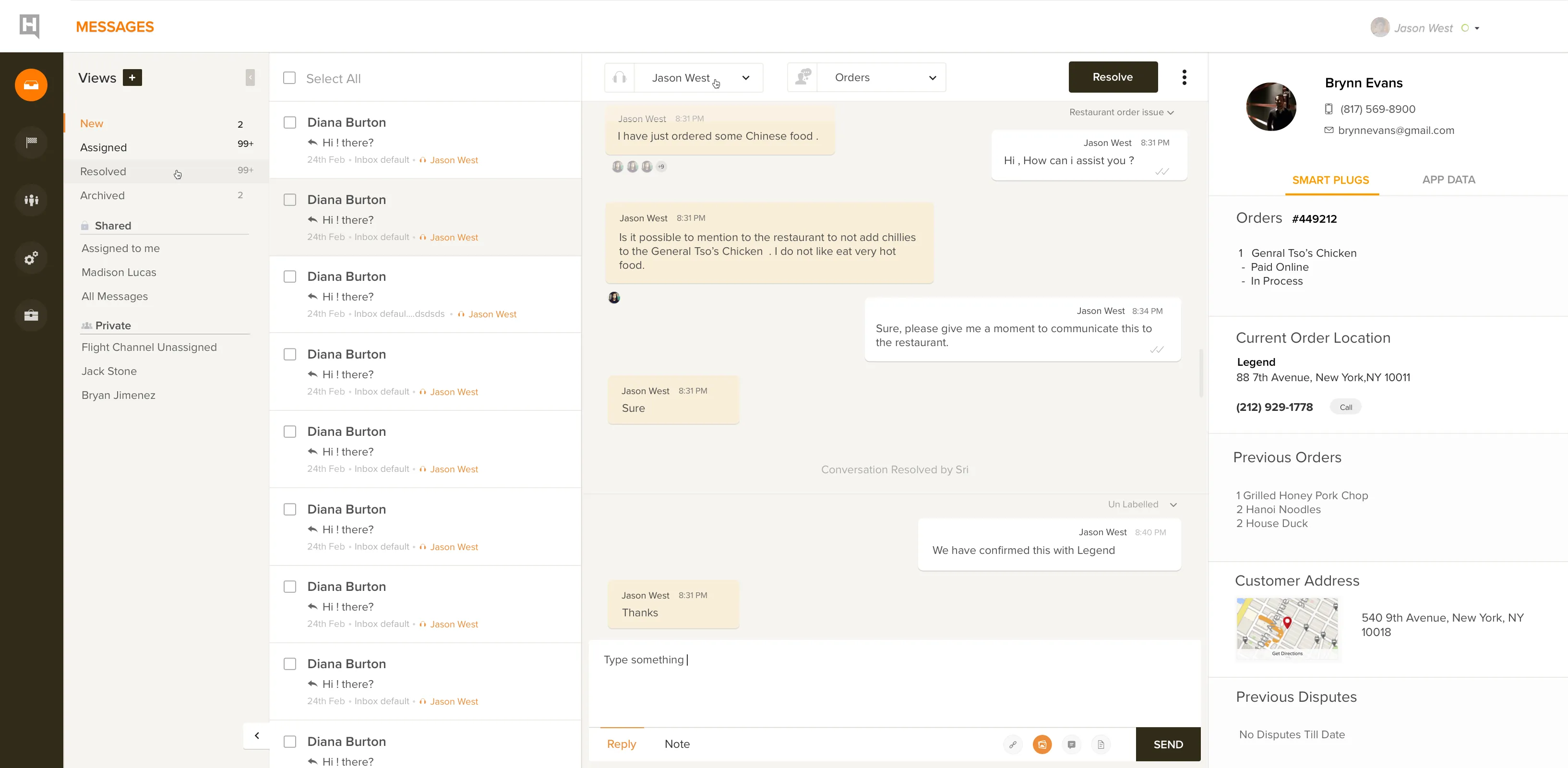
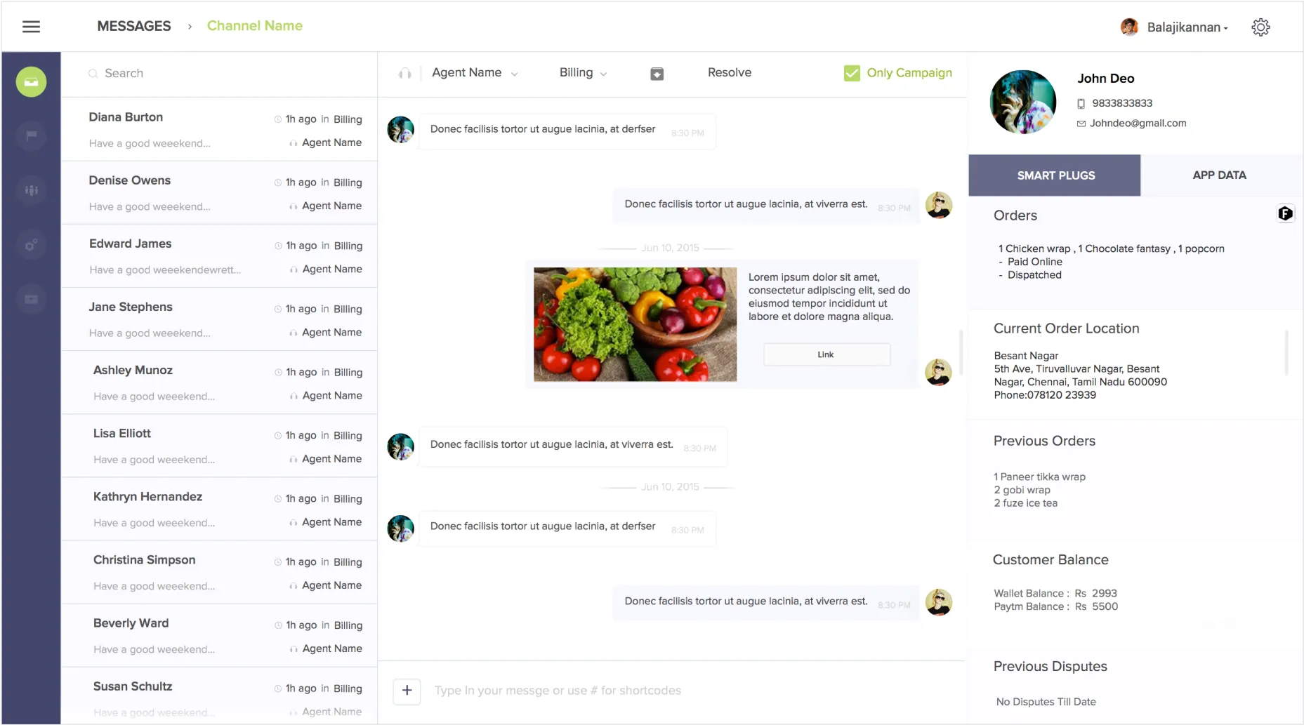
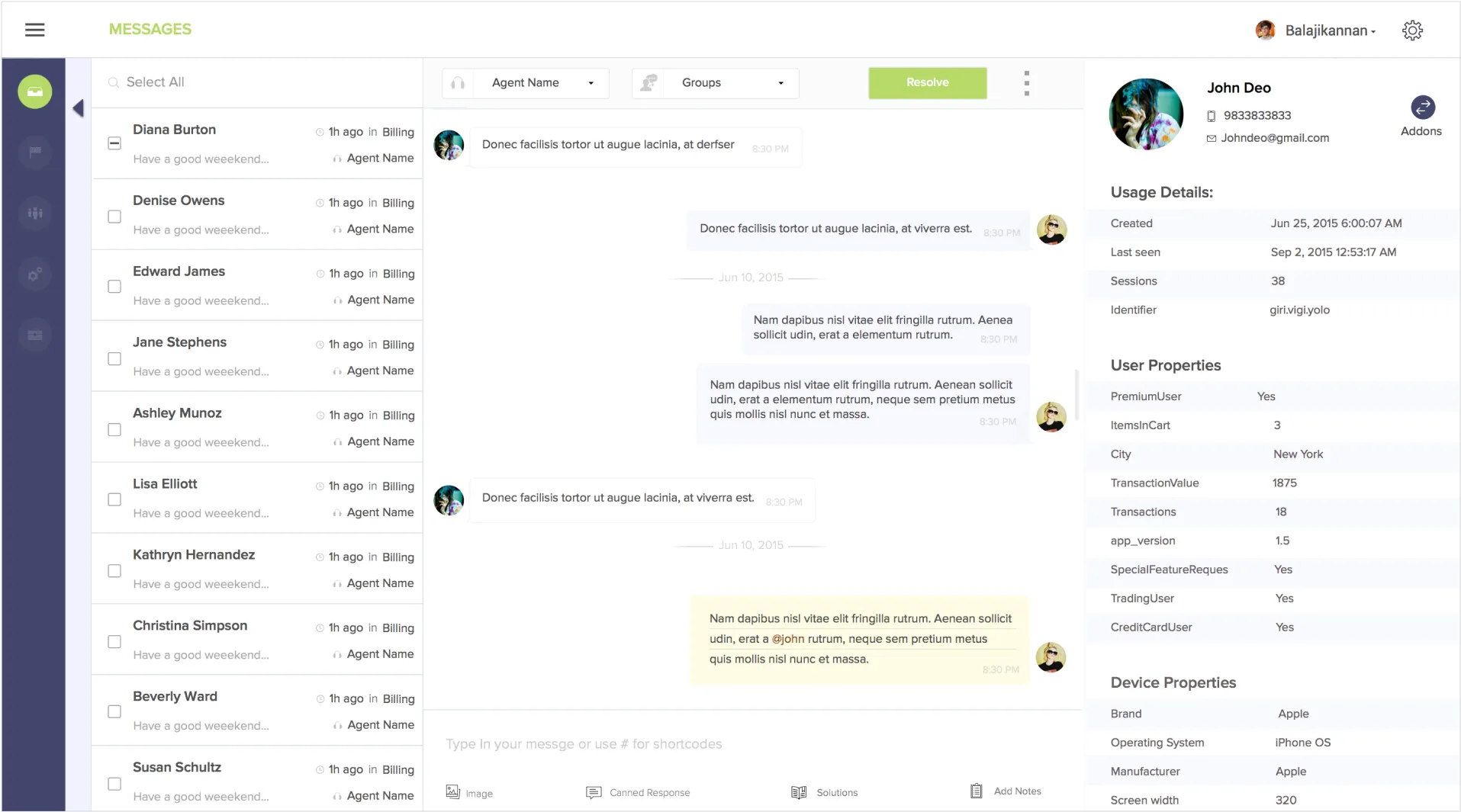
The old interface treated support conversations like email threads and page navigation like websites. We rebuilt it around a persistent split view: conversation list on the left, active thread in the center, user context on demand. Agents never had to fully navigate away to see what they needed.
-
Two-step conversation switching
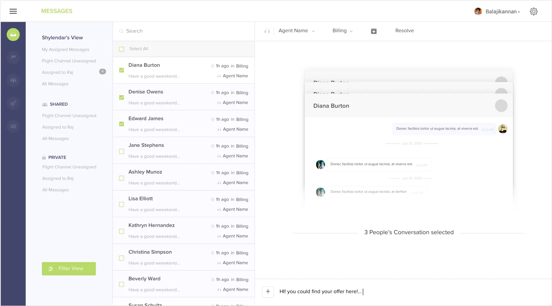
Moving between conversations required a full navigation step away from the active chat. We replaced it with a persistent left-rail conversation list: one click to switch, with the previous thread still visible until the next one loads.
-
Gmail-style threading
The message view borrowed email conventions (collapsed threads, click-to-expand, load waits) in a context where conversations are sequential, not threaded. We rebuilt it as a linear chat timeline with real-time presence indicators and no loading delays.
-
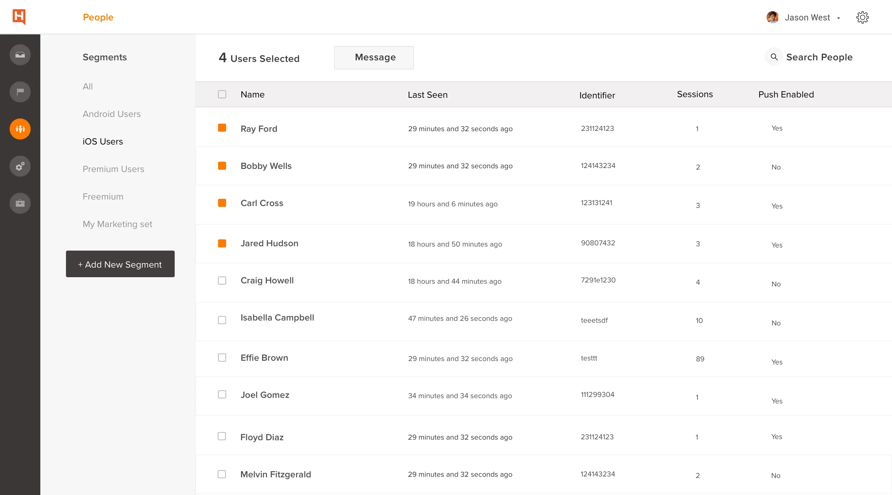
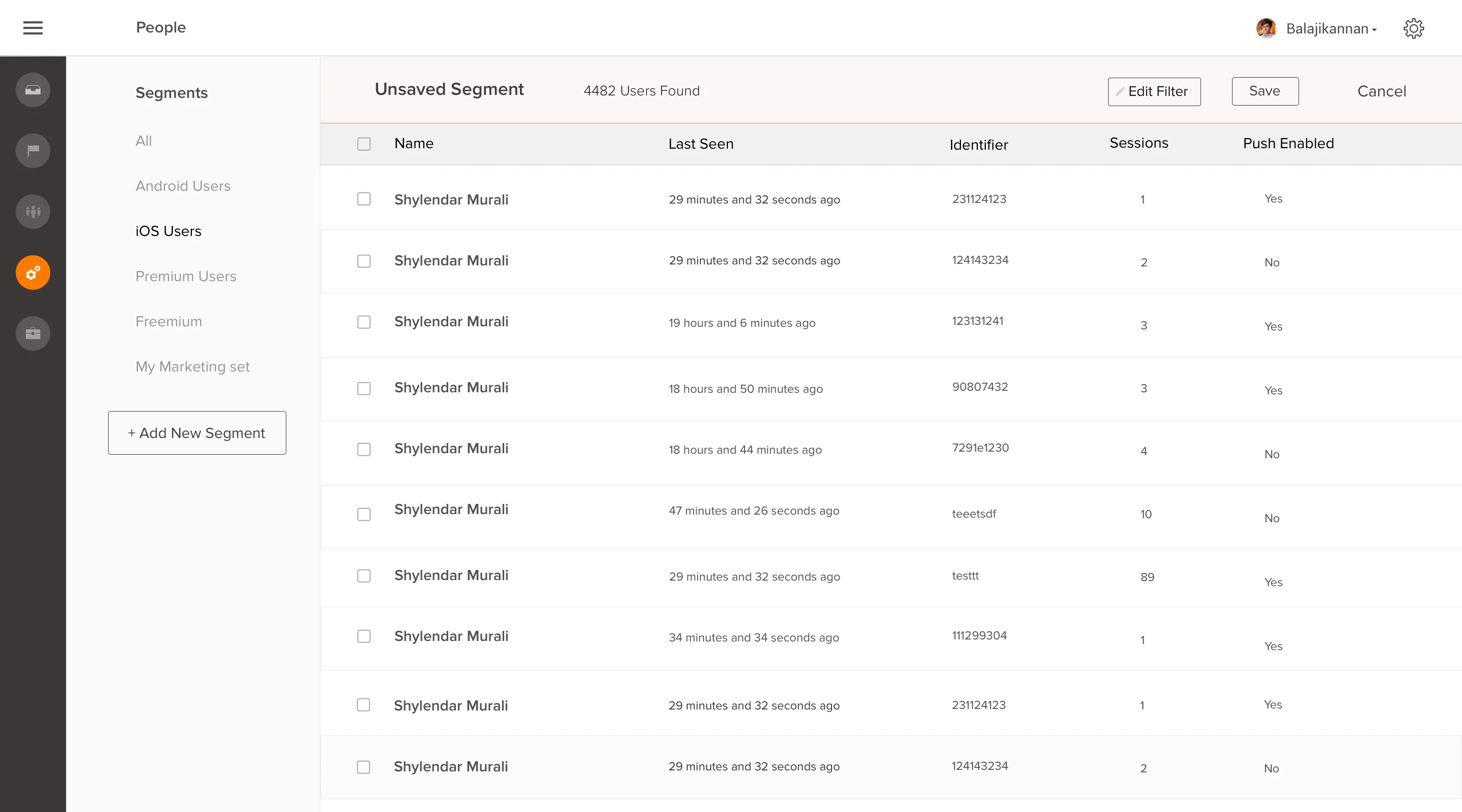
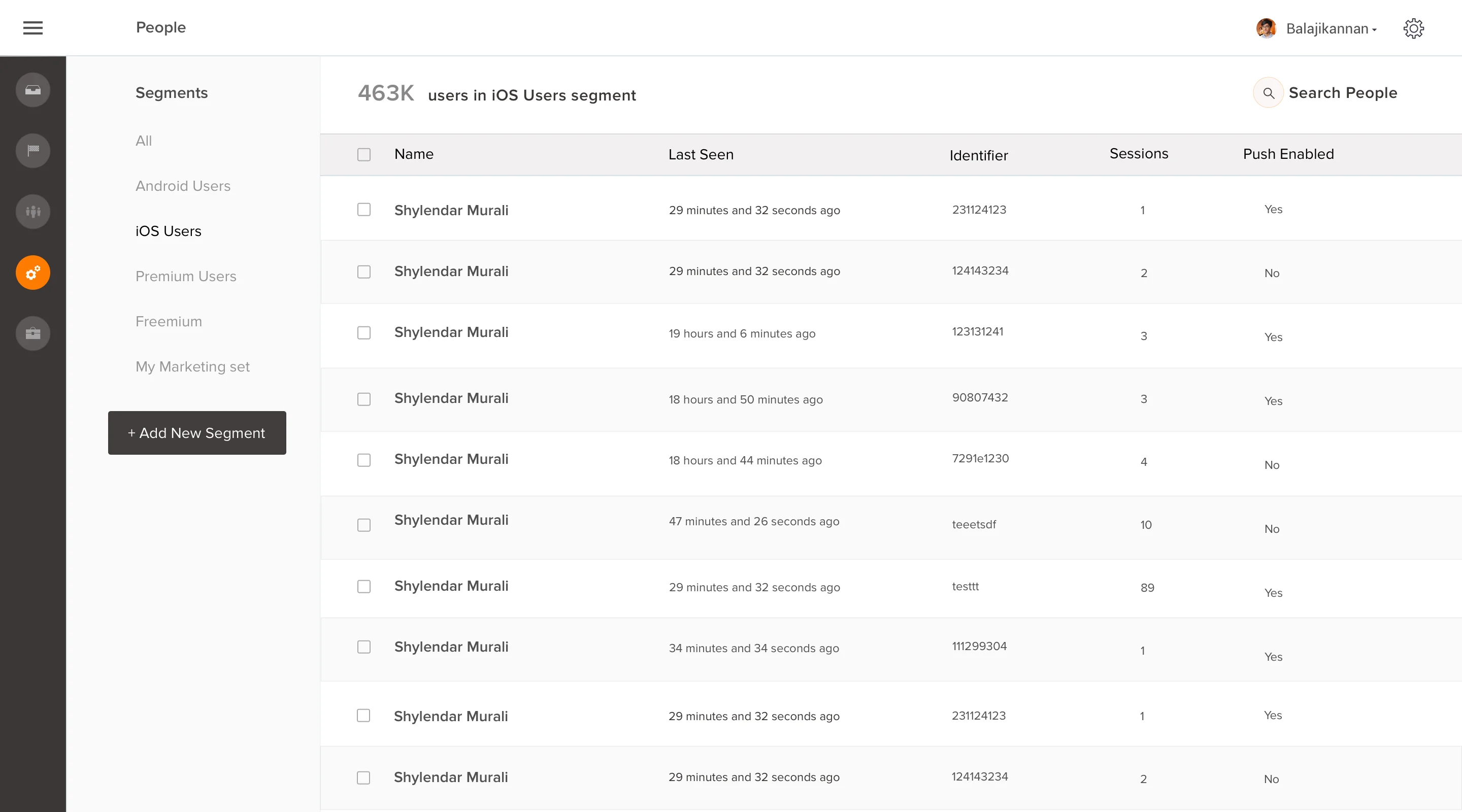
No filter or sort
Agents couldn't sort or filter their conversation queue. In a busy environment that meant manual scanning. We added a filter rail across status, priority, and channel, with a quick-assign action that kept agents in flow.
-
No user context panel
Any time an agent needed account history, tags, or user metadata, they had to leave the conversation. We built an on-demand detail pane that expanded from the right edge without navigating away from the active thread.
-
No search
There was no way to find a specific past conversation or message without scrolling backward through the queue. We added full-text search across conversation history and message content, with results opening inline so agents stayed in the same flow.
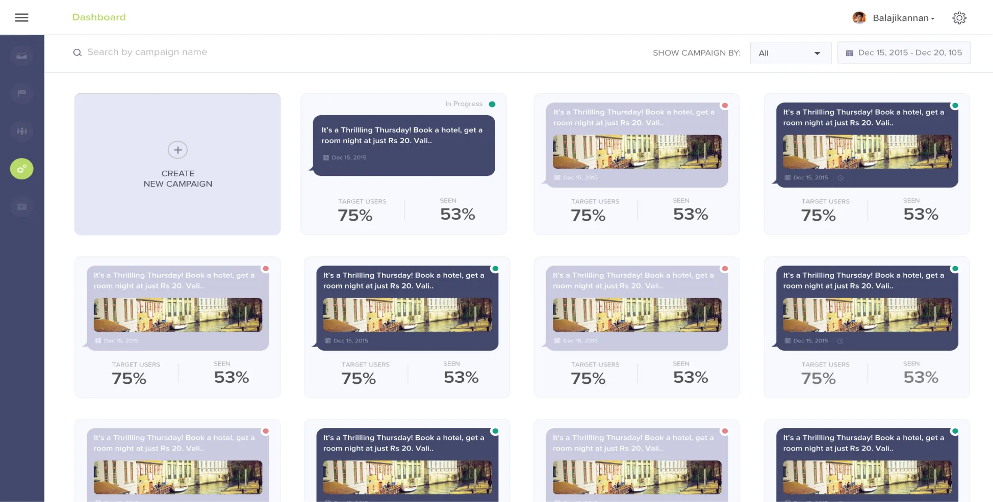
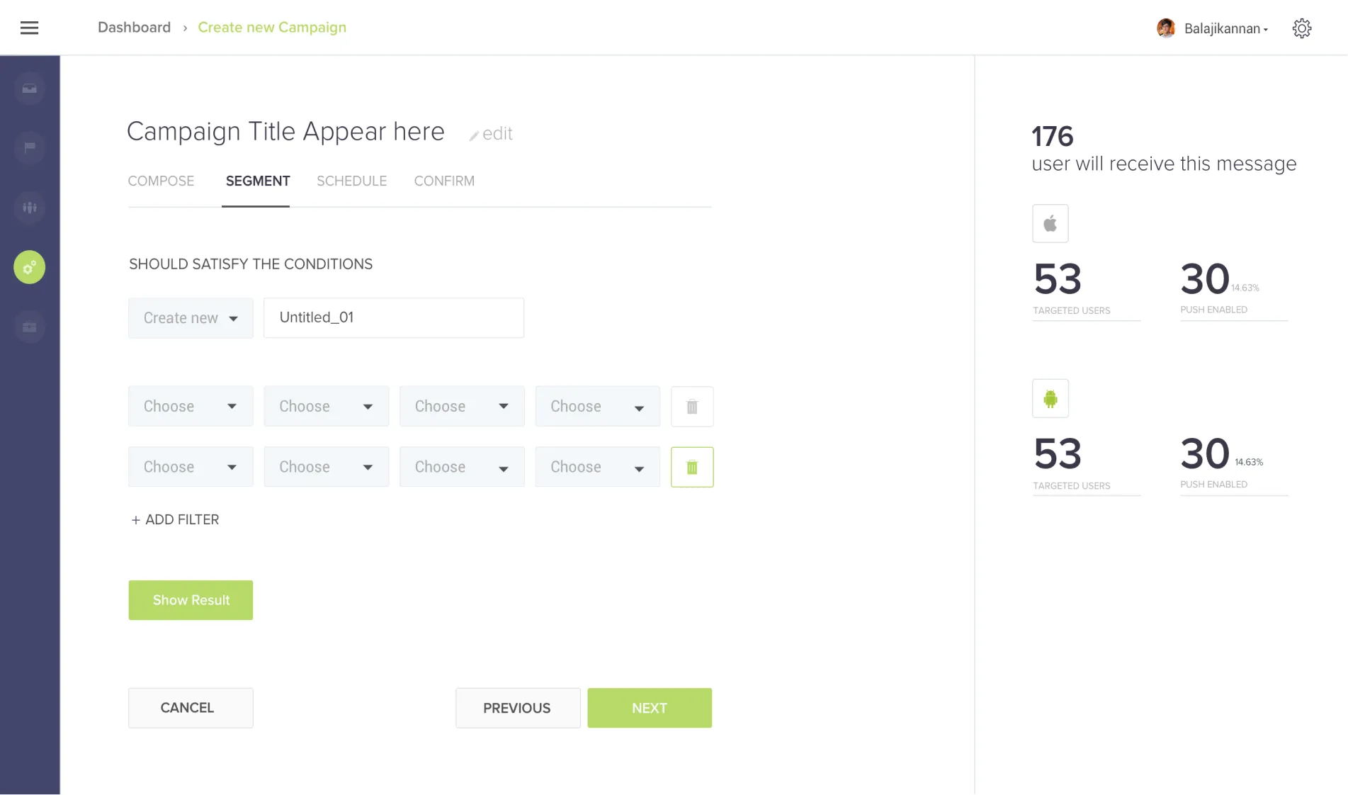
Four surfaces of the redesigned Hotline agent interface: dashboard, compose, campaigns, and segmentation.
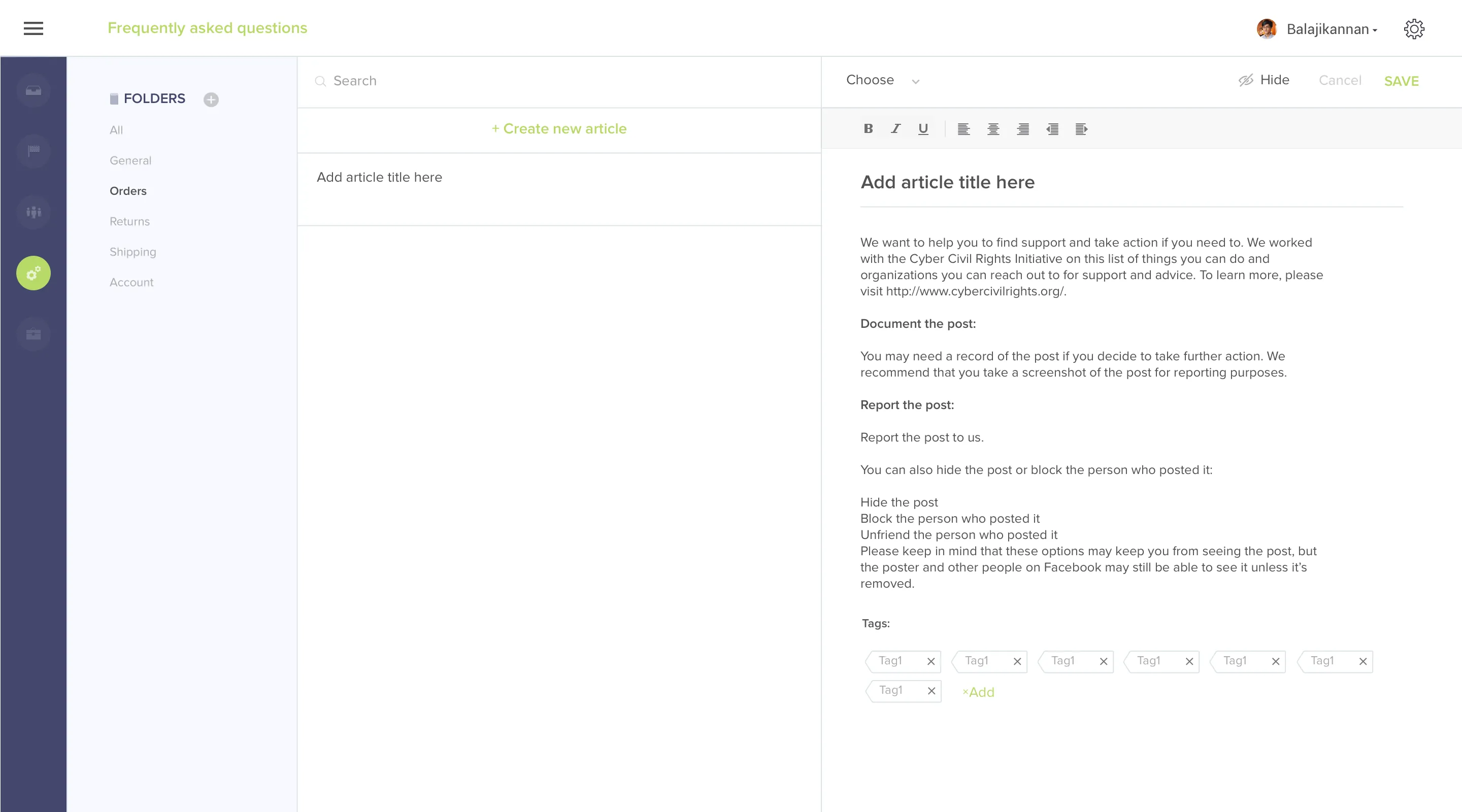
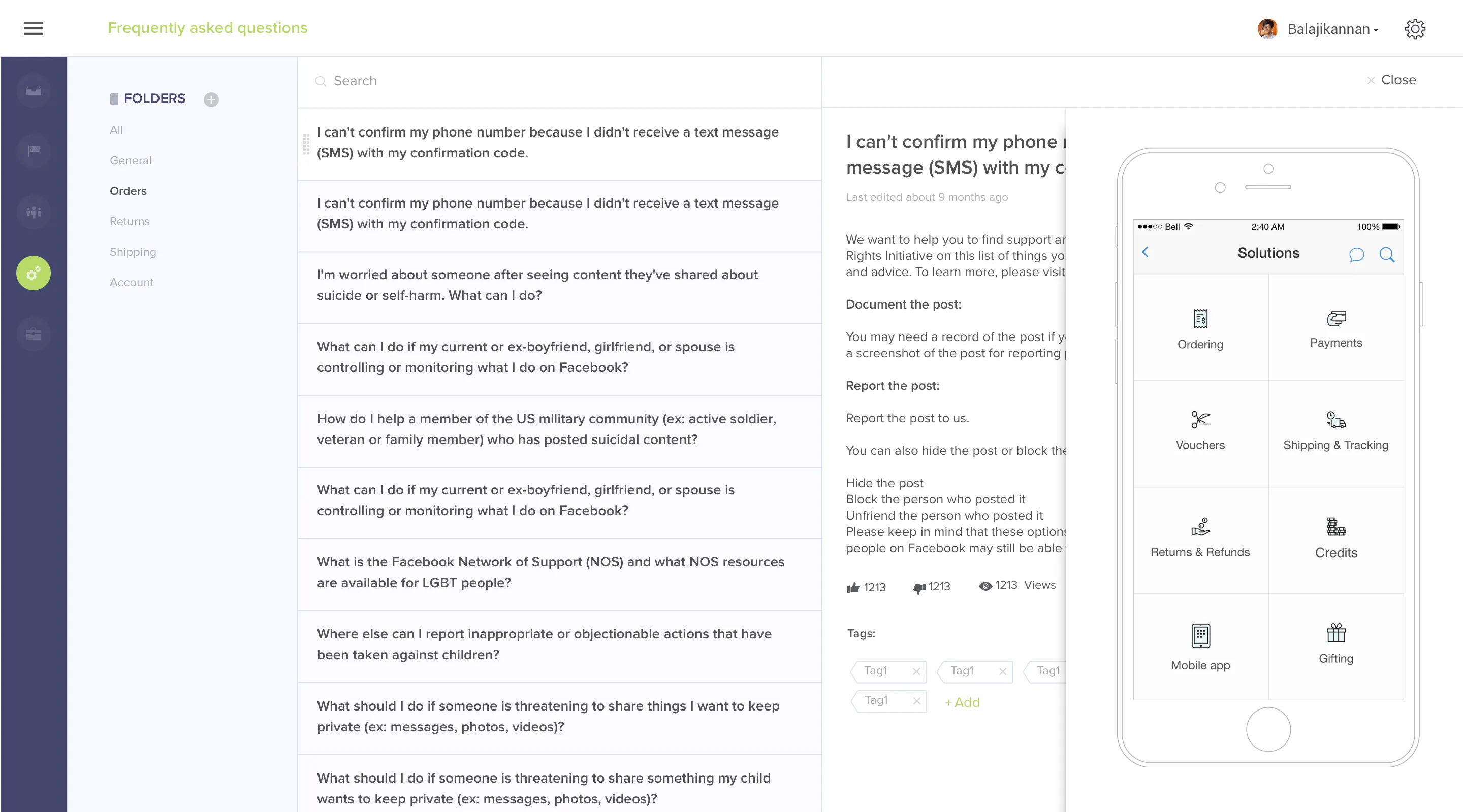
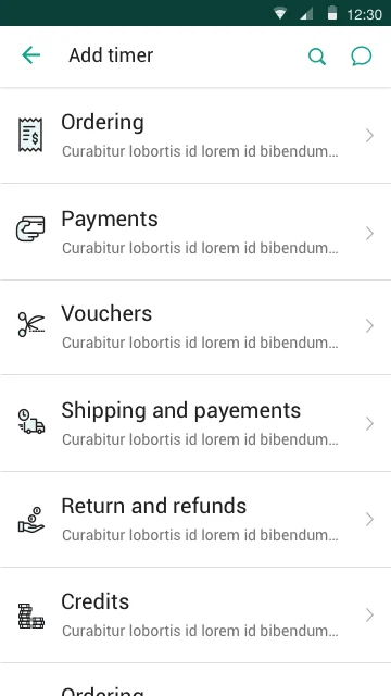
FAQs, secondary flows, and mobile SDKs had to feel like the same product.
The results came from operations, not the launch announcement.
Down from 8.4 minutes to 2.3. Agents could respond faster because switching, reading context, and composing were no longer separate navigation steps.
Customer satisfaction increased significantly. Faster, more contextual replies changed how support felt from the customer side, not just the agent side.
Conversations closed faster when agents had the right context in a single view. Time saved per ticket compounded across the full queue.
Hotline reached $5M ARR faster than any other product in Freshdesk's history at that point. Now absorbed into Freshchat, it serves 30M+ end users globally.
Reflections
The biggest design leverage was structural, not cosmetic. Once the information model changed (presence instead of pagination, context in-line instead of behind navigation), most visual decisions became smaller choices inside a clear frame.
The Smart Plugs surface was the call I didn’t expect to matter most. It started as a relatively small addition to the agent interface, a way to surface inline context from third-party tools without leaving the chat. It ended up being the primary reason customers switched to Hotline over alternatives. The lesson: the feature that lowers the activation cost of the main workflow often outperforms the main workflow itself.
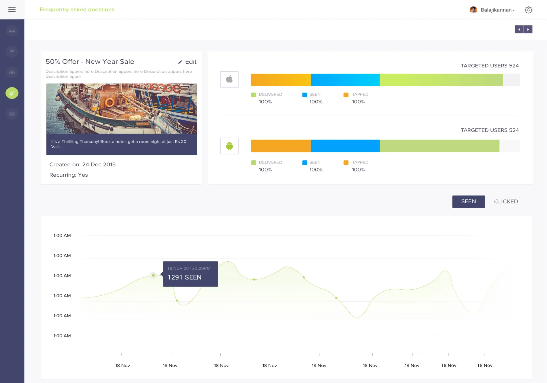
One thing I’d revisit: the campaign analytics surface. We rebuilt it for at-a-glance legibility, but with one designer across five surfaces simultaneously, it got less depth than it deserved. The data density was right. The filtering and segmentation options were not.