Designing discovery loops for Quick Commerce
I led a series of Quick Commerce discovery experiments at HungerStation, placing relevant grocery entry points inside high-attention moments across the food-ordering journey.
Food had attention. Quick Commerce needed discovery.
HungerStation already had a high-frequency food-ordering habit. My charter was to help more of those users discover and buy from its dark stores and grocery partners.
Place small shopping loops inside moments that already worked.
I treated discovery as a sequence of contextual experiments across order tracking, deals, and category browsing rather than another destination users had to remember.
110Mn SAR in additional Quick Commerce revenue.
This was the result of the wider Quick Commerce discovery charter. Individual experiments had different levels of measurement and maturity.
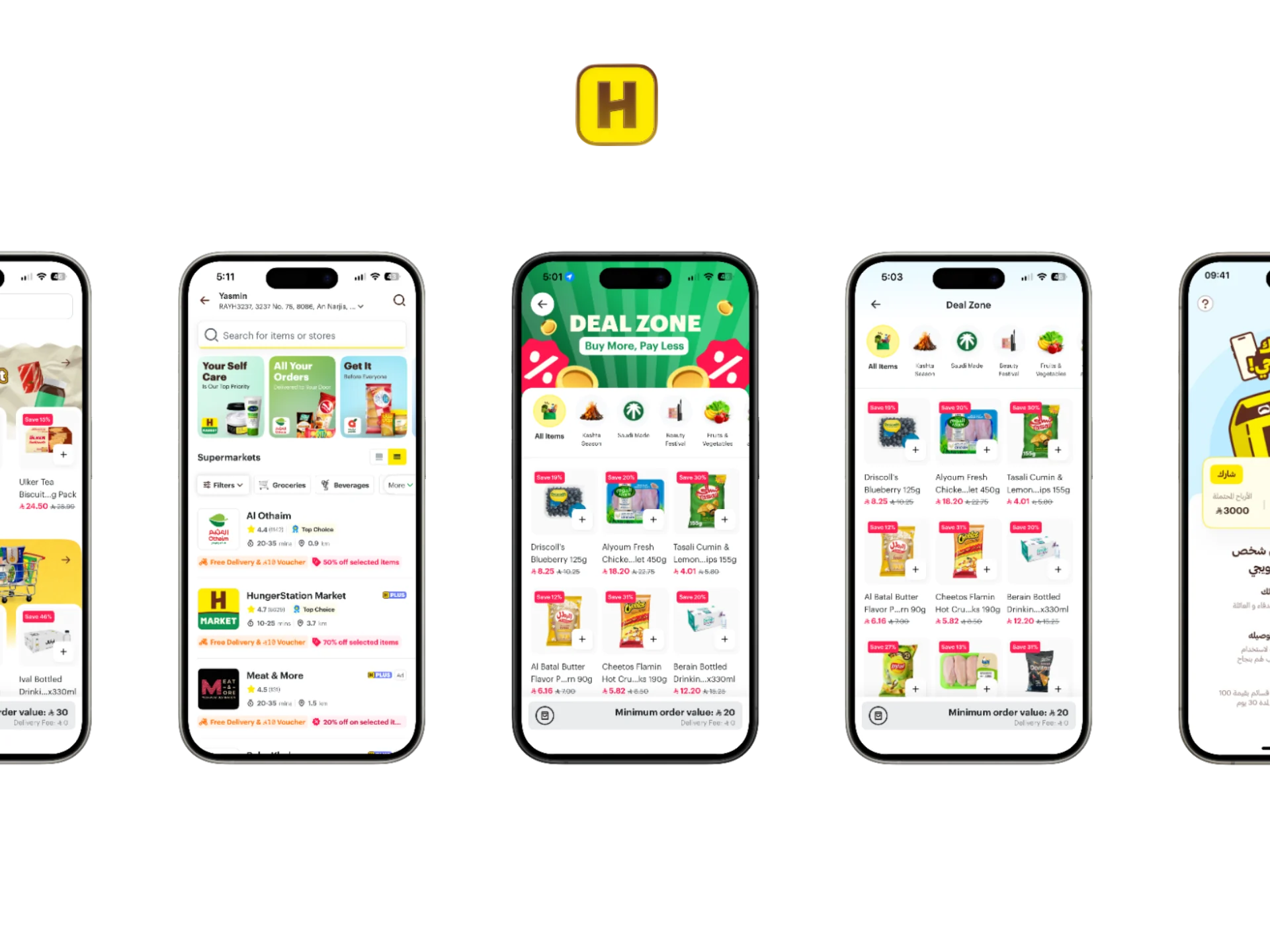
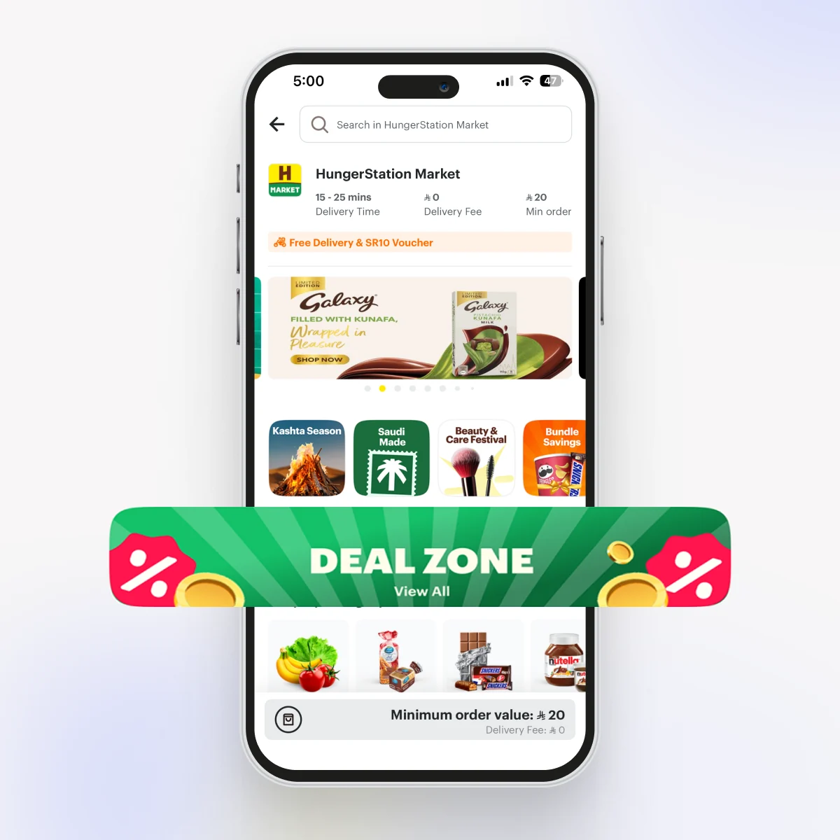
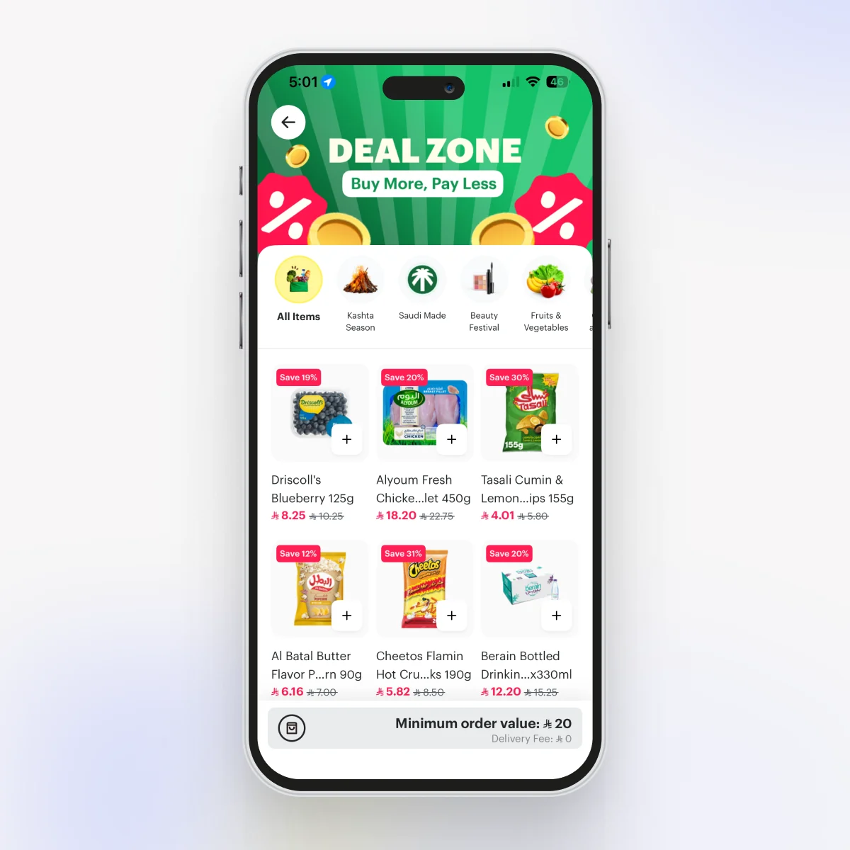
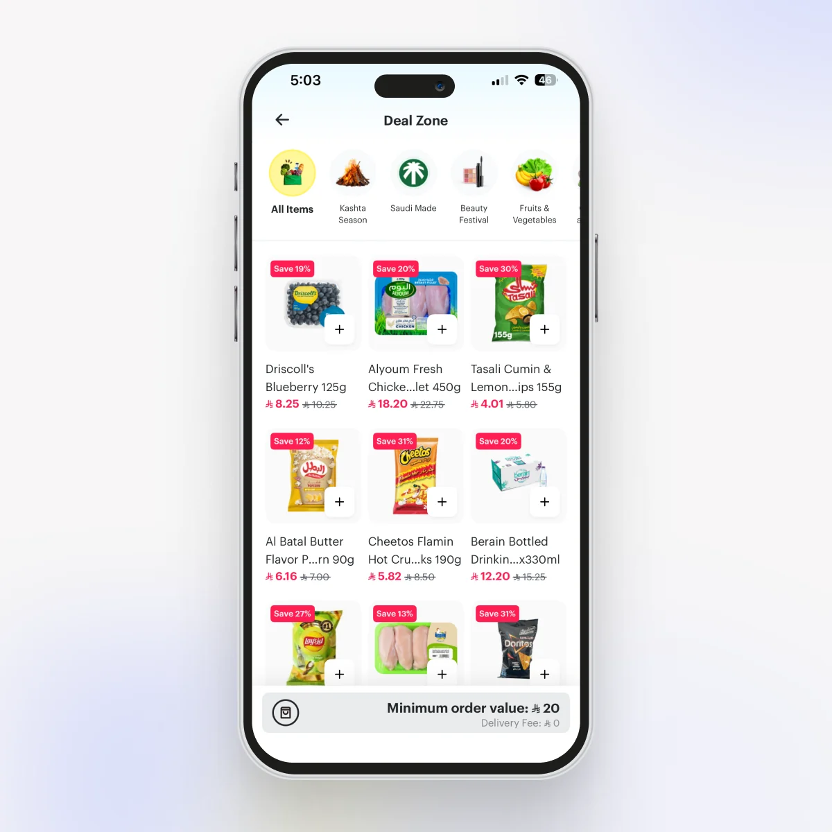
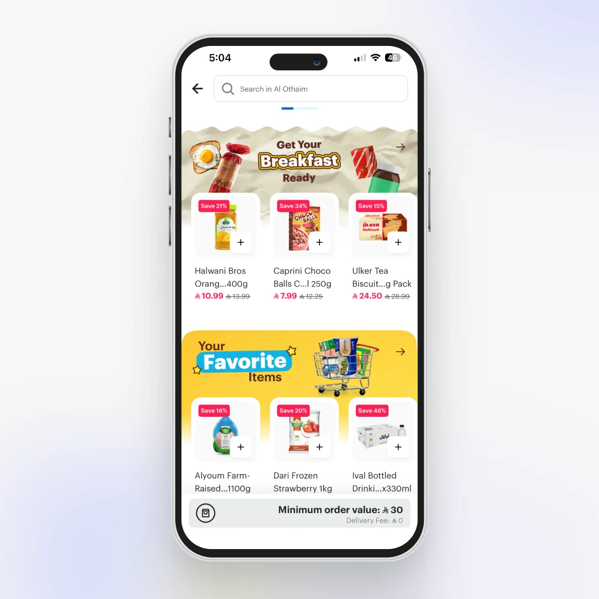
A dedicated entry point for Deal Zone.
When Deal Zone came up, the room had mostly made up its mind: ship it as one more campaign collection, a small square card in the rail next to the seasonal ones. I pushed back. A savings destination this big shouldn’t have to fight for a thumbnail. It needed its own way in and its own page.
So I argued for two things. A dedicated entry point on the store landing, and a custom Deal Zone page with an “All items” view I added on top of the individual categories. I also kept making the case for a large header banner the team kept calling a waste of space, until they let me test it. It stayed, and it’s a slot we can monetize or seasonalize later.
We launched with HMarket and a few AAA vendors (Lulu, Carrefour, Al Othaim), and it did well enough that we rolled it out to every vendor. That listing pattern later became the backbone of HungerStation’s main category exploration.
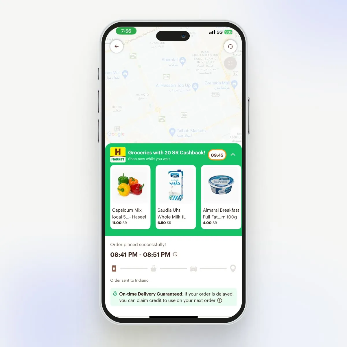
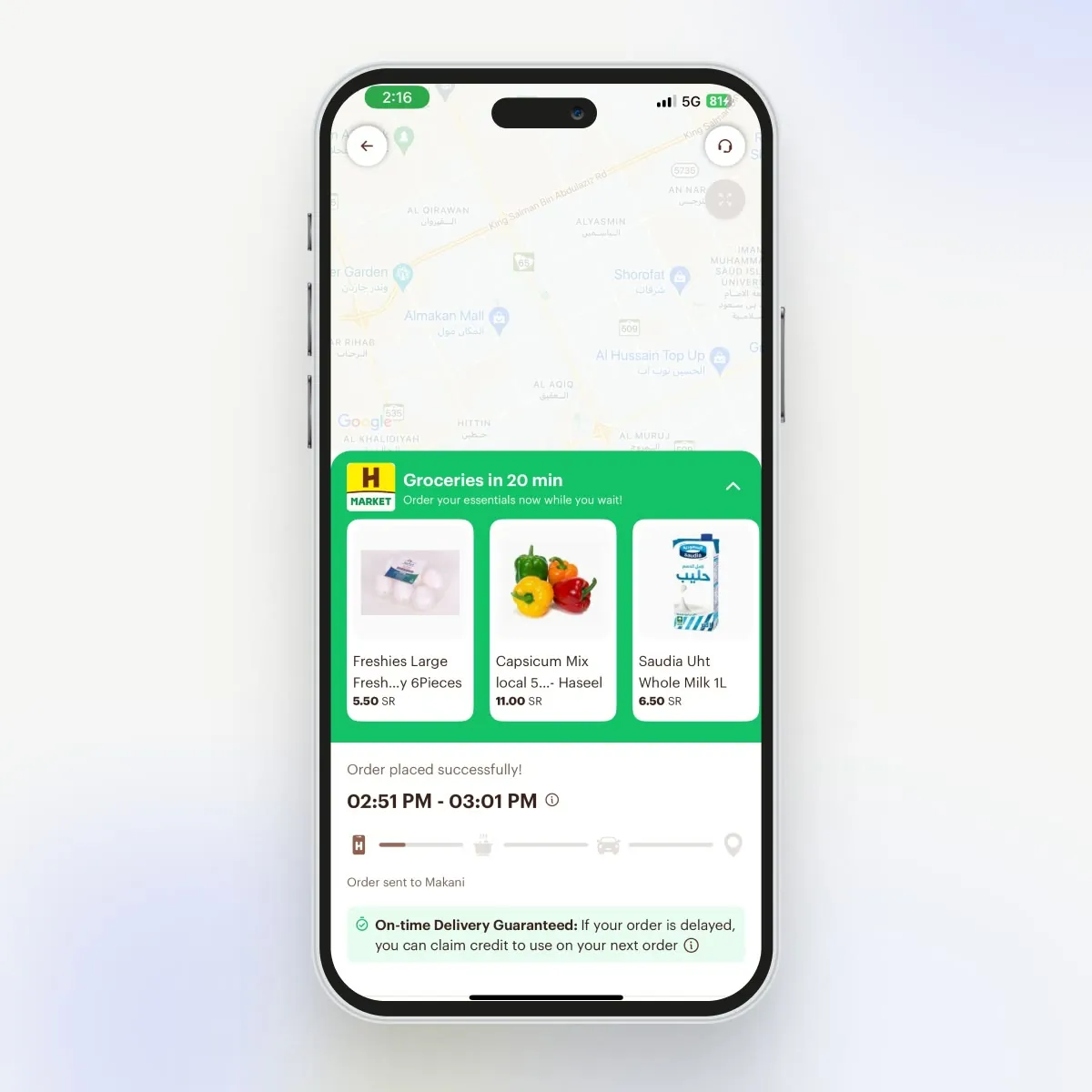
A second basket during the delivery wait.
After placing a food order, users repeatedly checked the tracking page and had a few minutes of attention. I designed an HMarket shelf that could introduce relevant products without competing with delivery progress.
We kept both cashback and non-cashback versions so the loop remained useful when an offer budget was unavailable.
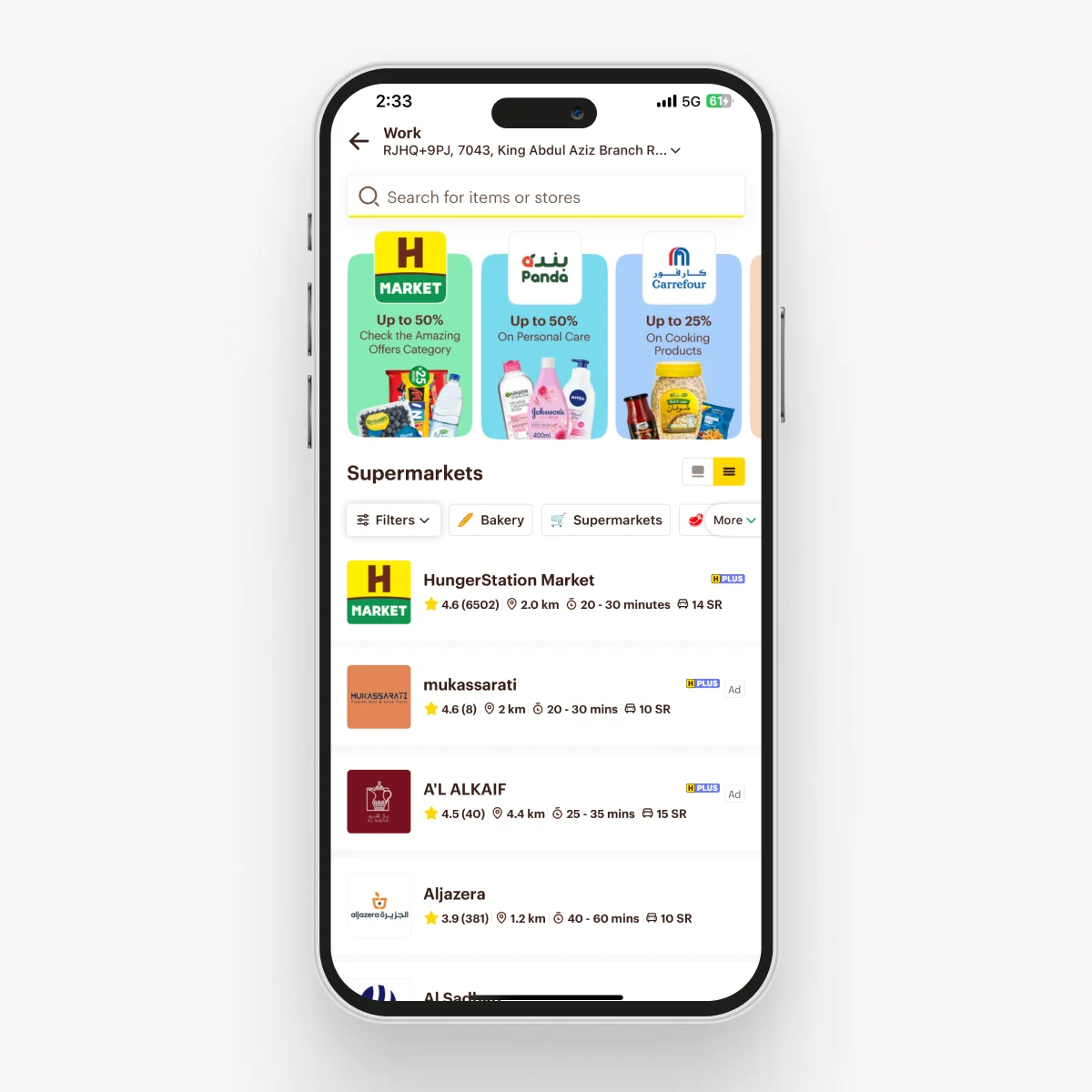
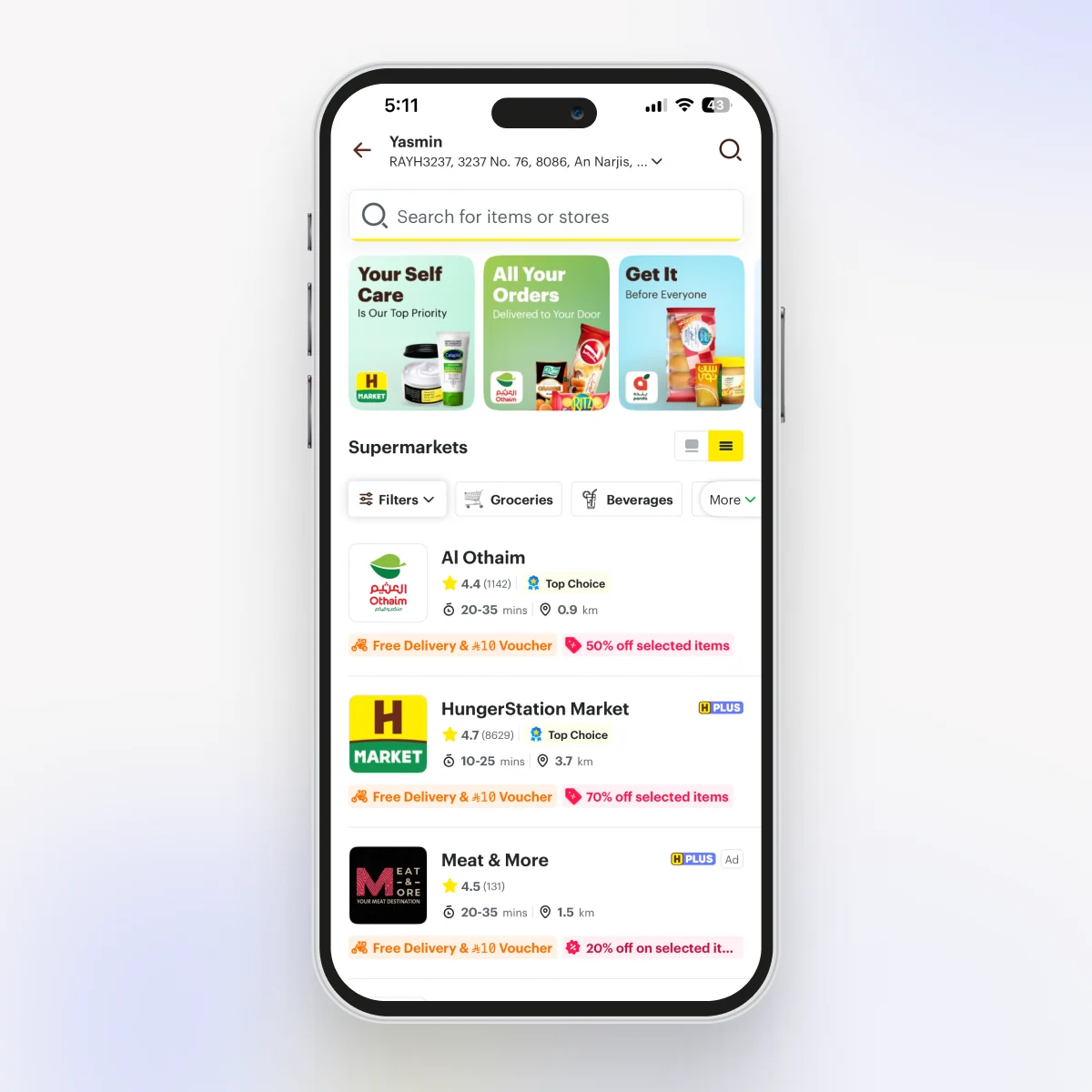
A supermarket listing that’s easy to scan.
Discovery did not end at the entry point. I also reworked the supermarket listing so users could scan available stores, offers, delivery times, and categories with less effort. The redesign moved generic promo tiles aside and surfaced what actually drives a choice, like ratings, distance, delivery time, and live offers, right on each store row.
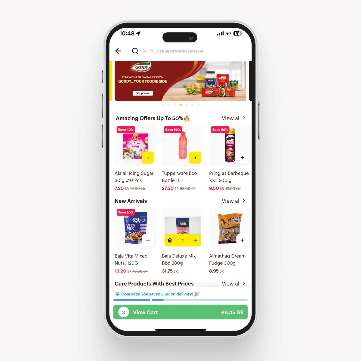
Shoppable merchandising banners.
The store listing was stacked horizontal rows of items under plain text titles. It worked, but it got repetitive fast and every store ended up looking alike. I added a merchandising unit that sits an image header on top of a product row, so a section can set a mood instead of just naming itself. It also shipped as an ad placement brands could buy, so the visual lift came with a new revenue line.
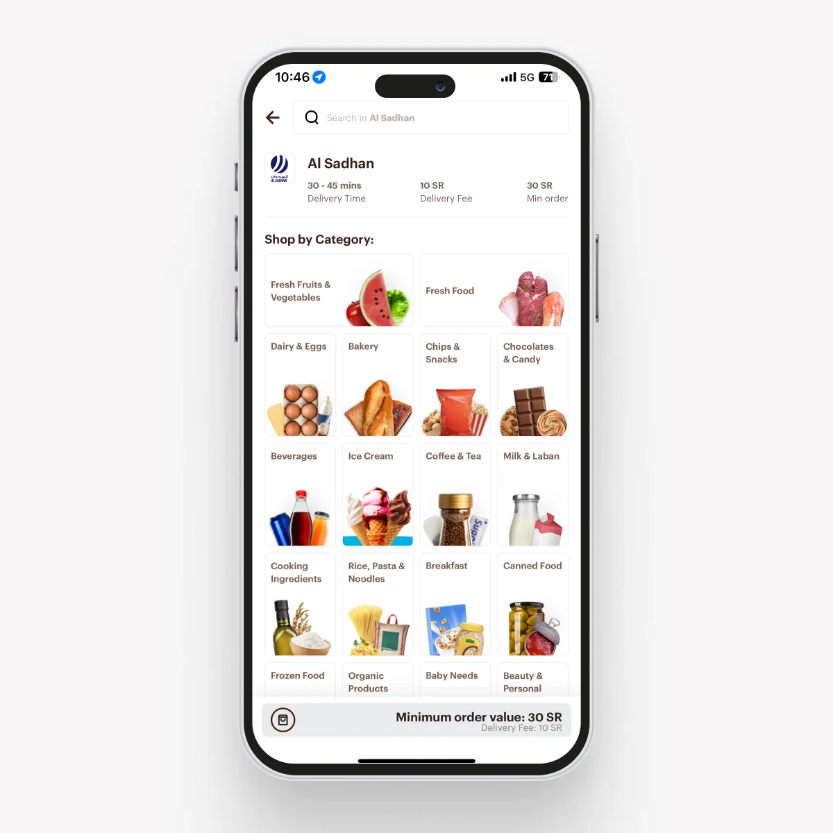
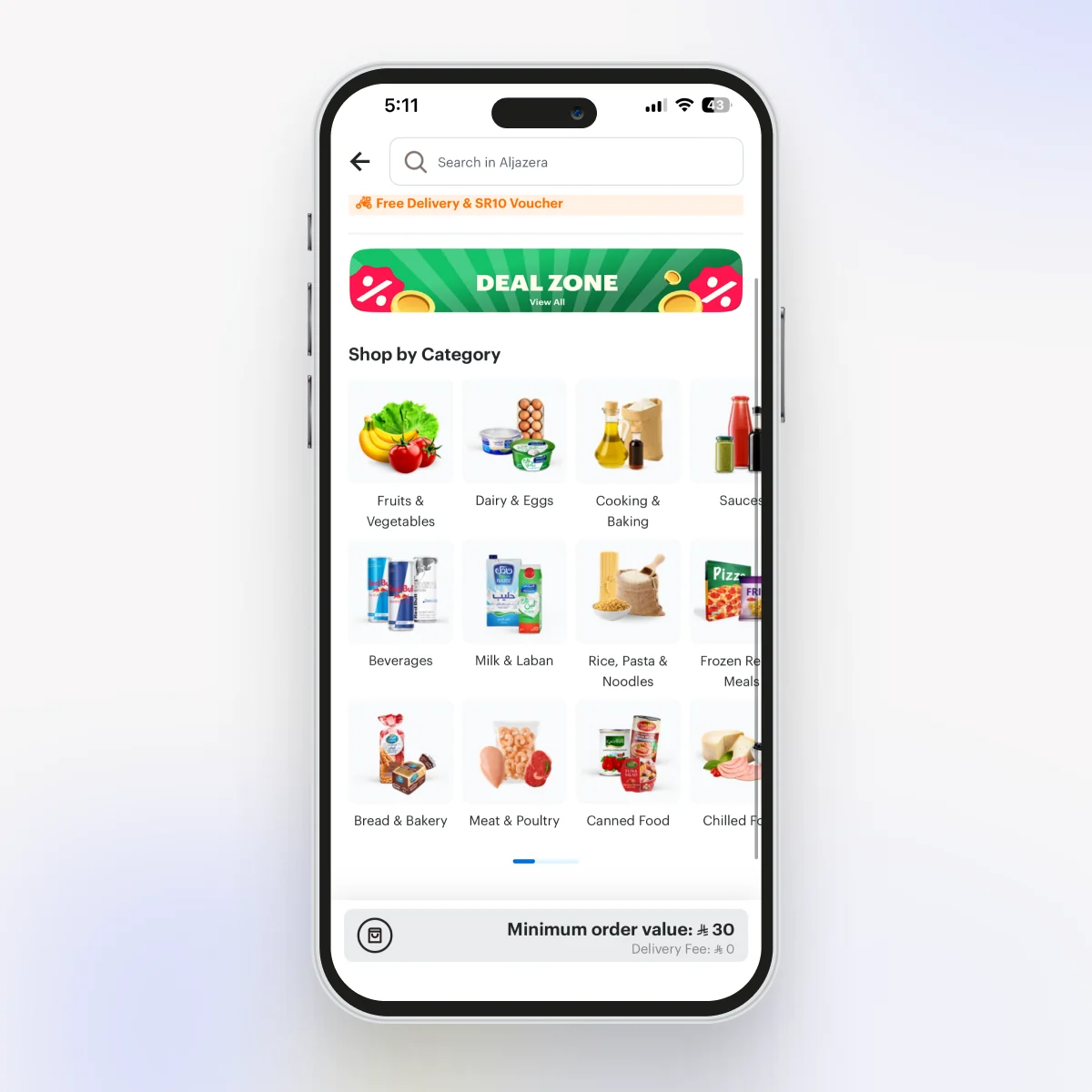
A scalable category selector.
Each category used to be a boxed card with the title and image locked together, and the whole set ran down the page in one long vertical scroll. It didn’t scale and it looked busy. I separated the image from the label, moved everything into a fixed-height horizontal scroll widget, and we built our own logic for ranking which categories surface first. The result is calmer, more consistent, and much easier to extend.
Across the whole discovery charter, these experiments added 110Mn SAR. What stuck with me wasn’t the number. It was that discovery worked best as lots of small, well-placed loops inside the food journey people already had, not one big destination I had to talk them into visiting.