Power bank rental, designed from zero
0-to-1 app for a startup building power bank rental stations across India. The market was brand new, the hardware was in development, and there was no comparable product in the country to borrow from.
An unfamiliar product in an unfamiliar market.
Power bank rental was not a concept Indian consumers had encountered. Unlike China where WeChat mini-programs and rental services were already commonplace, India had no reference point. The app had to introduce the concept and make it feel trustworthy, while the user's phone battery was probably already dying.
Founding designer. All surfaces.
Research, interaction design, visual design, prototyping, product management, and strategy, from first concept through launch. No existing design team, no prior product to inherit.
A working product in a category that didn't exist yet.
Shipped iOS and Android apps covering the complete rental loop: onboarding, finding a station, renting, returning, and auxiliary flows. Built for users in a hurry with low battery, the worst possible moment to encounter friction.
Build something people have never used before, fast, for when their phone is dying.
The hardest design constraint wasn't the interface. It was designing for users whose patience was already zero. Every second of confusion was a reason to abandon.
Borrow mental models from what people already trust.
Indian consumers already understood Uber, Ola, and Ofo. We designed the rental flow around the same spatial logic (find nearby, tap, confirm, go) rather than asking people to learn something new. Familiarity was the product, not novelty.
-
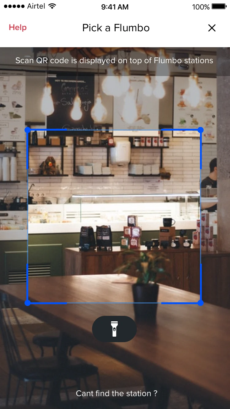
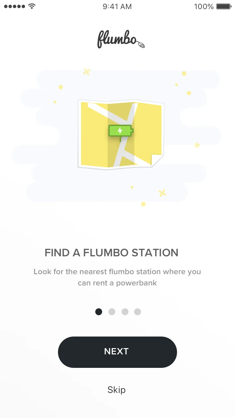
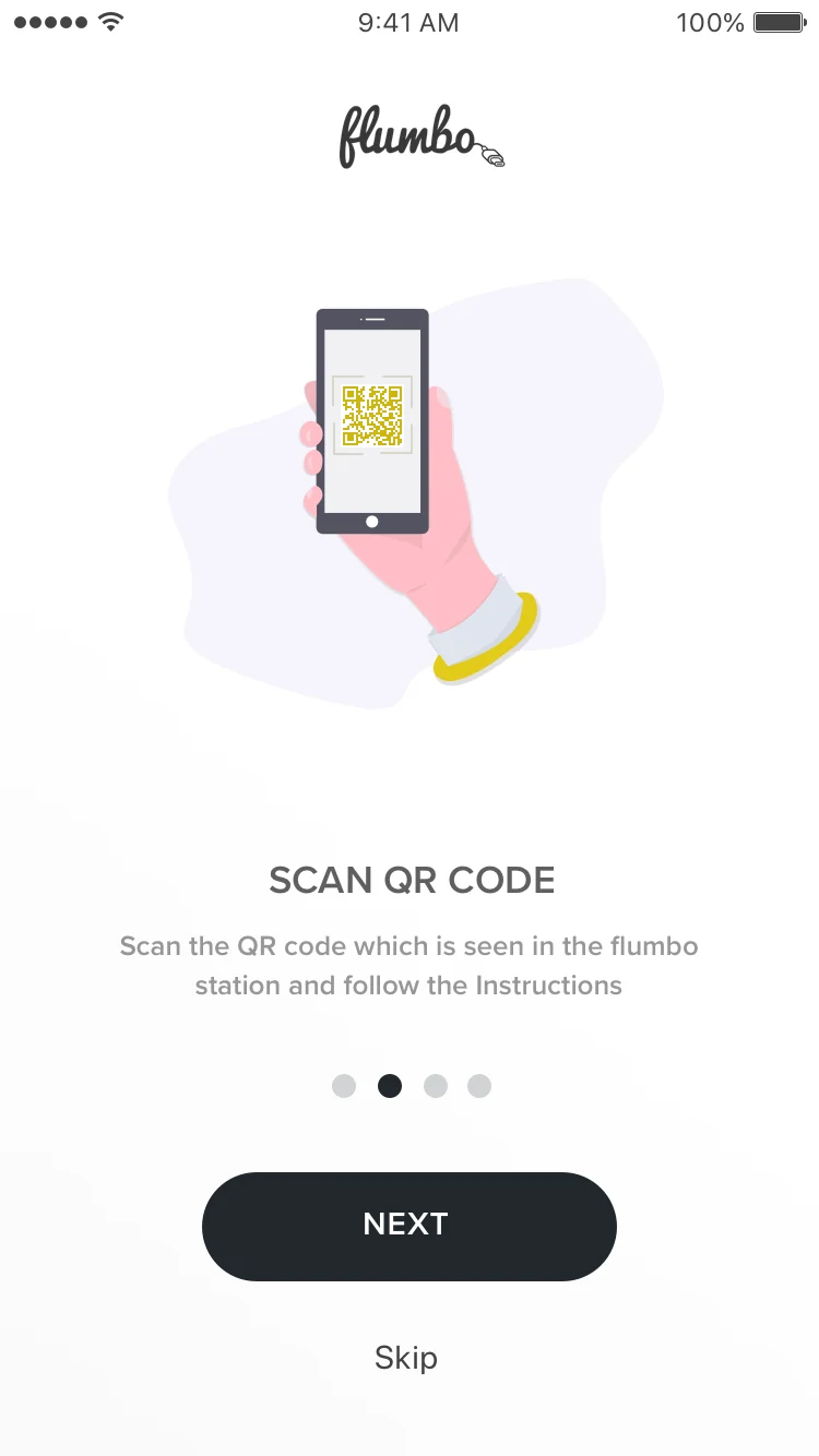
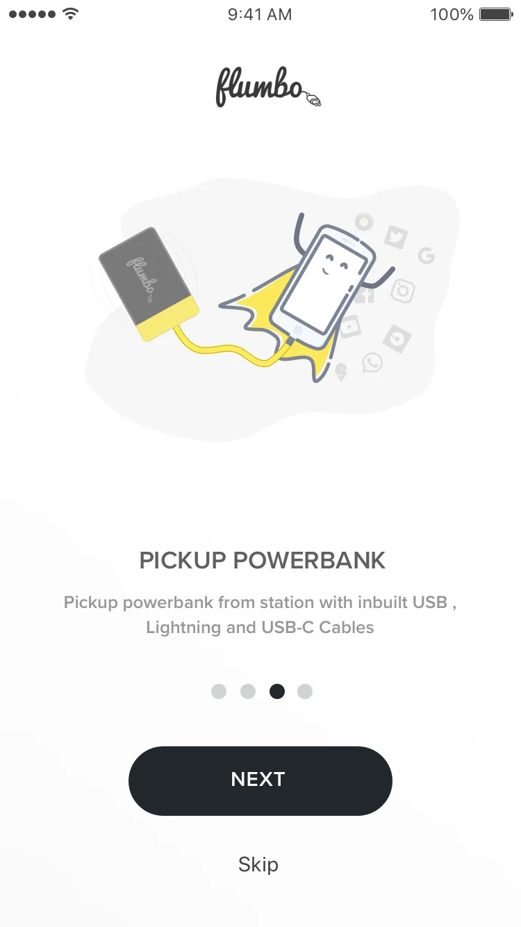
Onboarding in a category with no precedent
Users had no frame of reference for power bank rental. We designed onboarding that explained the concept in one gesture rather than a tutorial: show the station, show the bank, show the return, in the time it takes to read three screens.
-
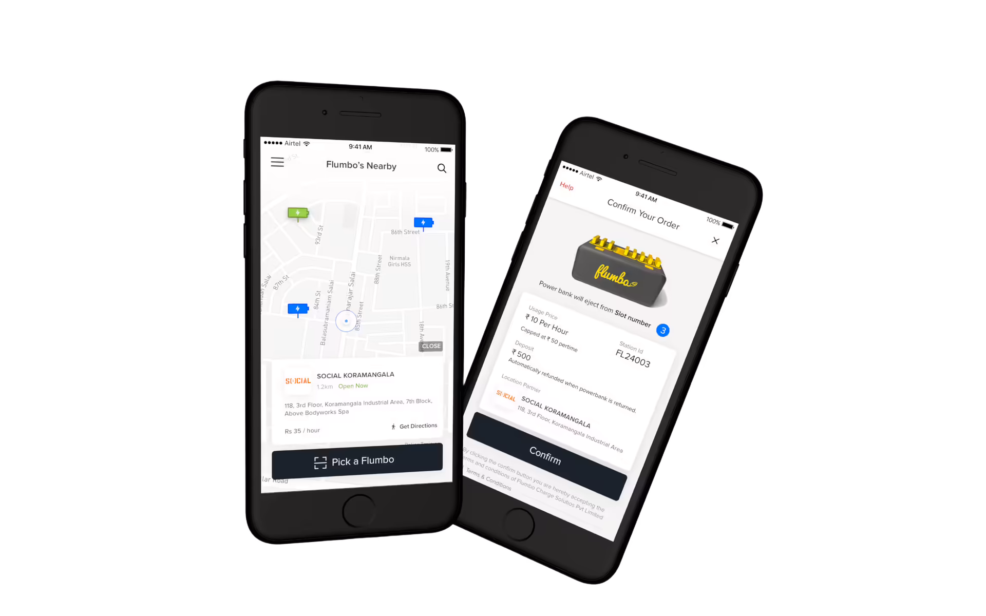
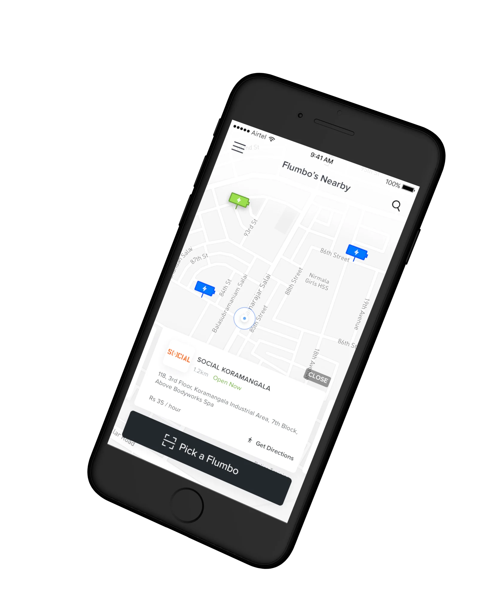
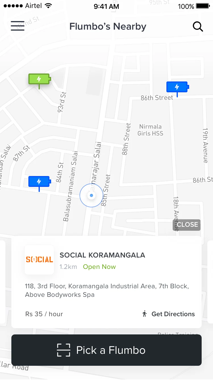
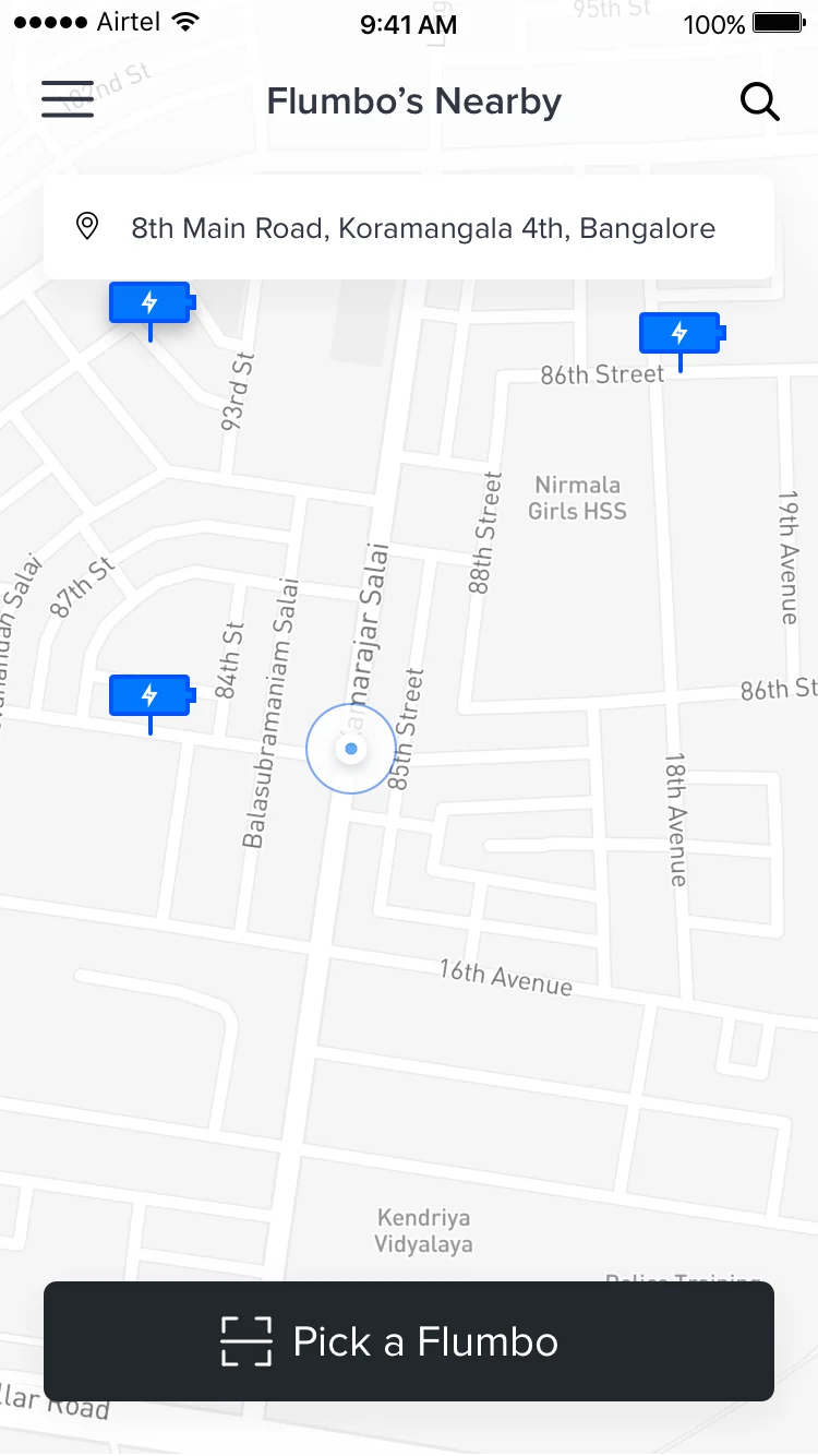
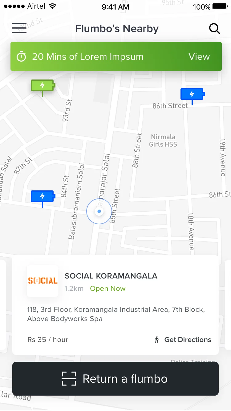
Finding a station under time pressure
The home screen had one job: show the nearest Flumbo station immediately. No splash, no nudge, no upsell. Map-first, station highlighted, one tap to navigate.
-
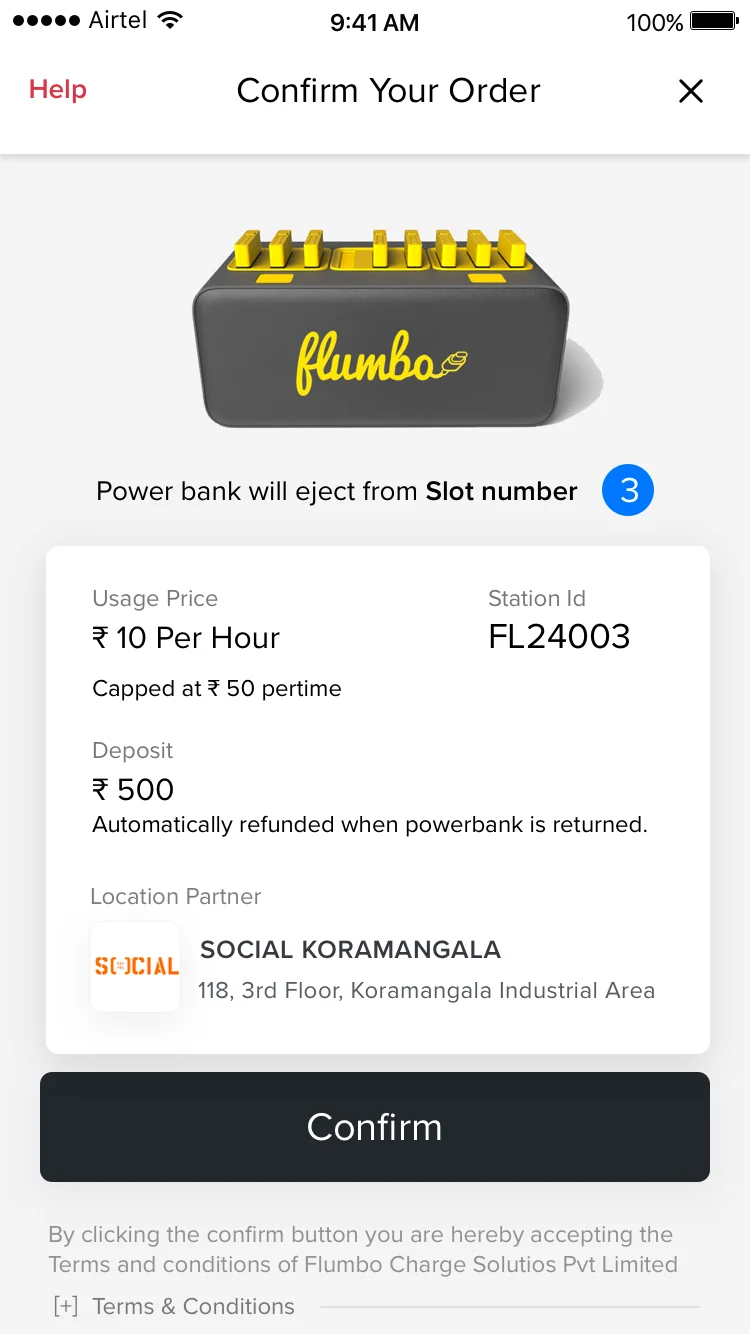
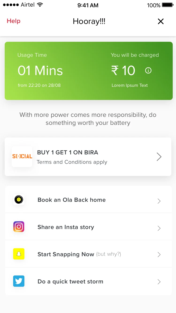
Renting when you're already anxious
Low battery is a stressful state. Every extra tap is a cost. We reduced the rental flow to the minimum viable confirmation: station → bank selection → confirm. Three steps, no dead ends.
-
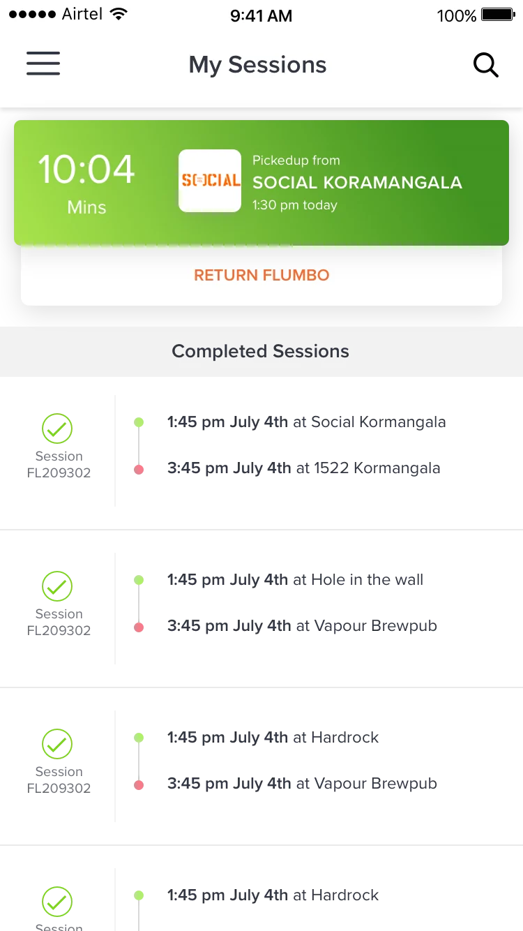
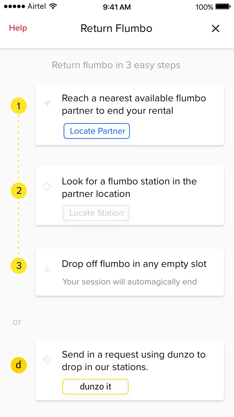
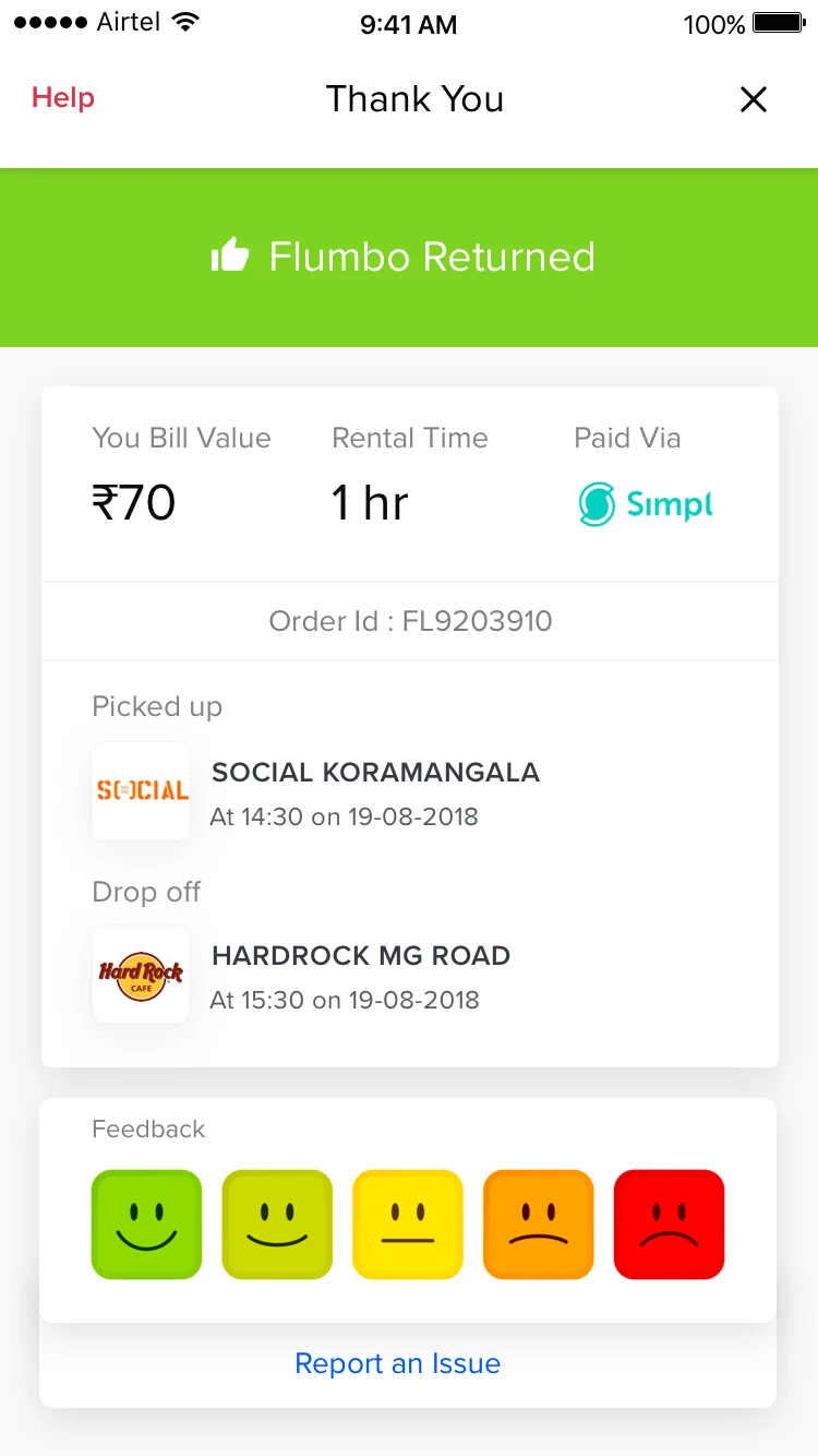
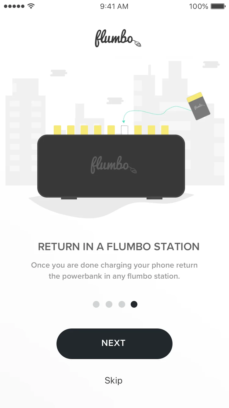
Return flow for an unfamiliar artifact
Returning a power bank was a new behavior. We designed the return flow with explicit station guidance and a clear completion state so users knew the transaction was done and they were no longer liable.
What I'd do differently
The biggest design risk wasn’t the UI. It was assuming the mental model would transfer. The Uber analogy worked for the spatial part (find, go, use), but broke down at the hardware level. Users didn’t have intuitions about which bank slot to use or what the indicator lights meant. A better first version would have designed the physical interaction into the onboarding, not just the app.
The return flow also needed more investment. Renting was motivated: users needed power. Returning was unmotivated: users had power and wanted to leave. We underestimated how much the return state needed its own persuasion logic.