Dashboard and reports redesign
Redesign of Hubstaff's main dashboard and reports surface, a time-tracking and workforce management platform used by remote teams. Circa 2018.


Reflections
Work from 2018 on Hubstaff’s dashboard and reporting surfaces. Example works, not a detailed case study.
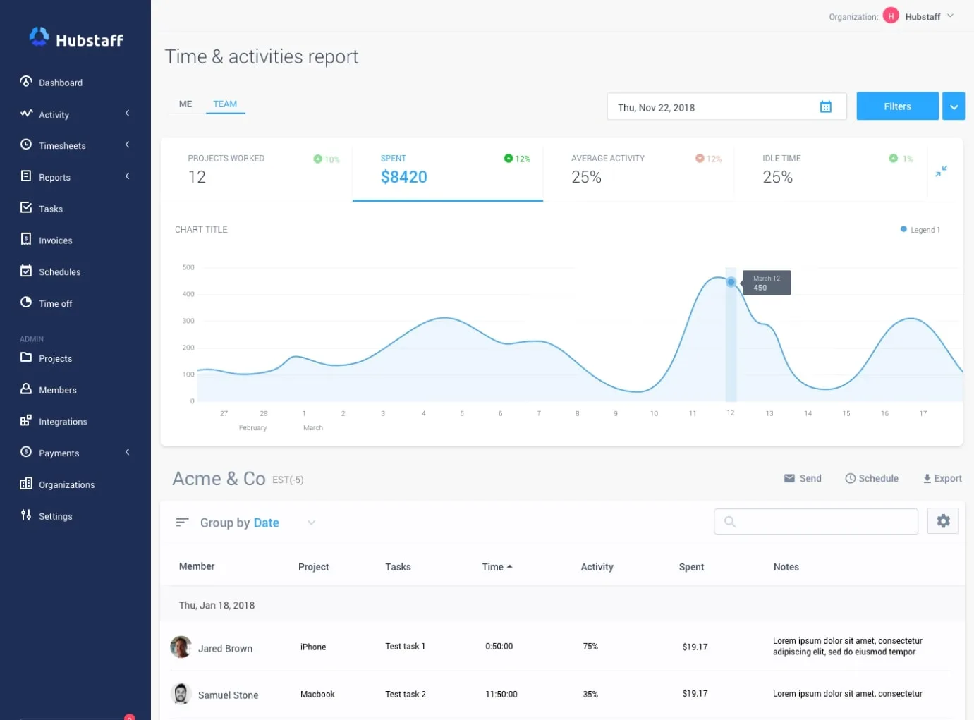
Dashboard redesign. Rethinking the main dashboard to surface the metrics that matter most to team leads: who is active, what’s being worked on, and where time is going. The existing dashboard was information-dense but not decision-dense.
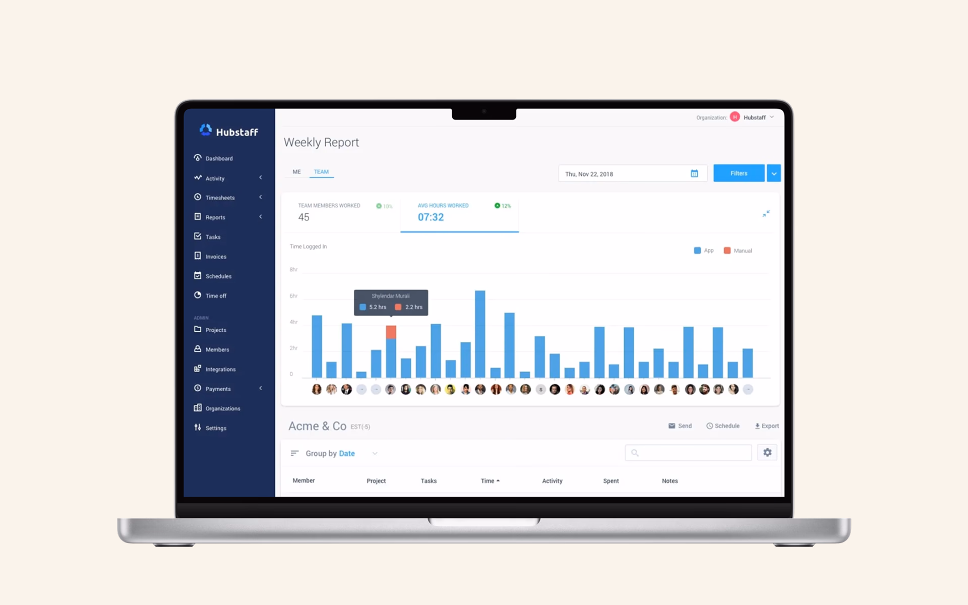
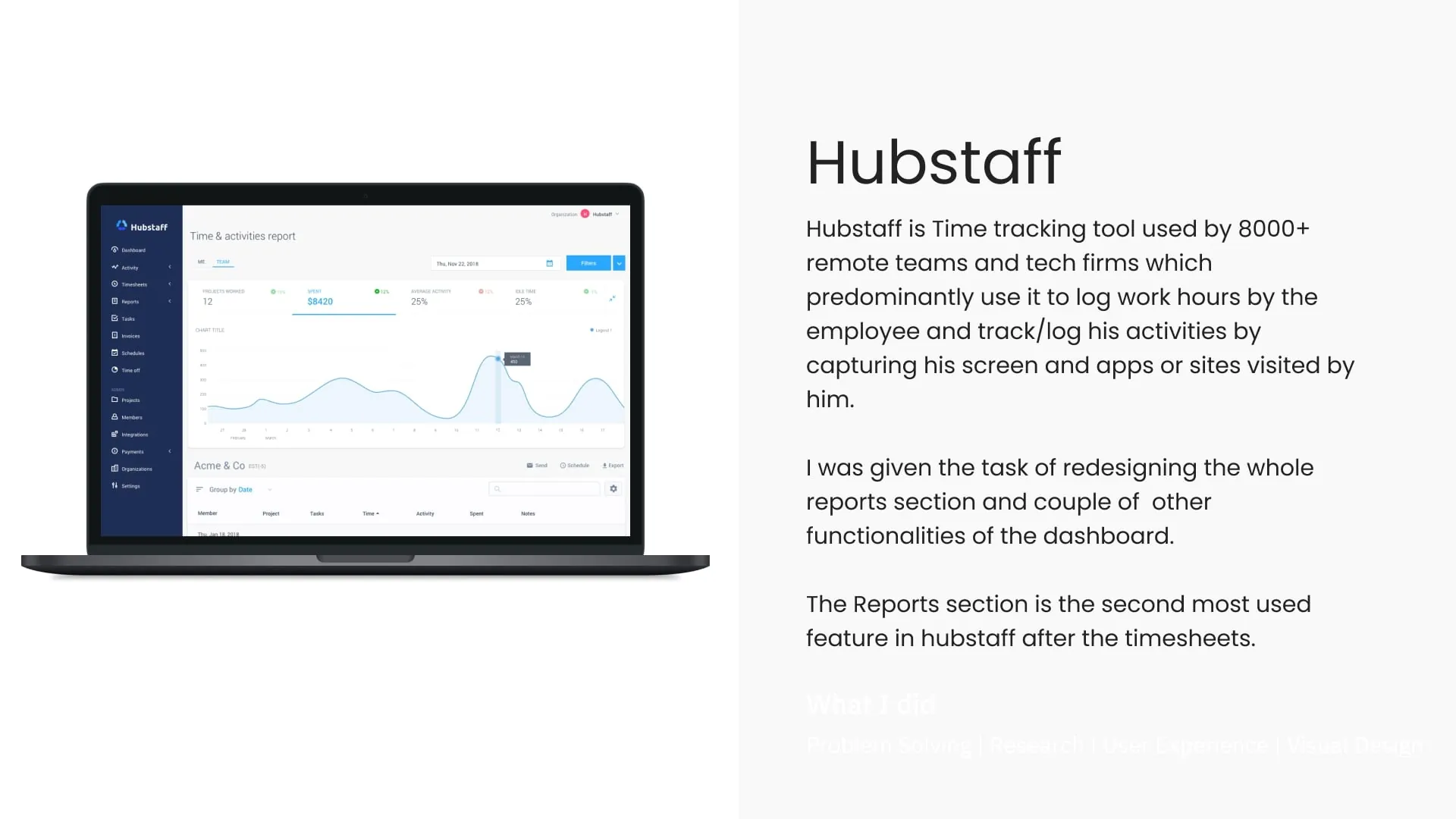
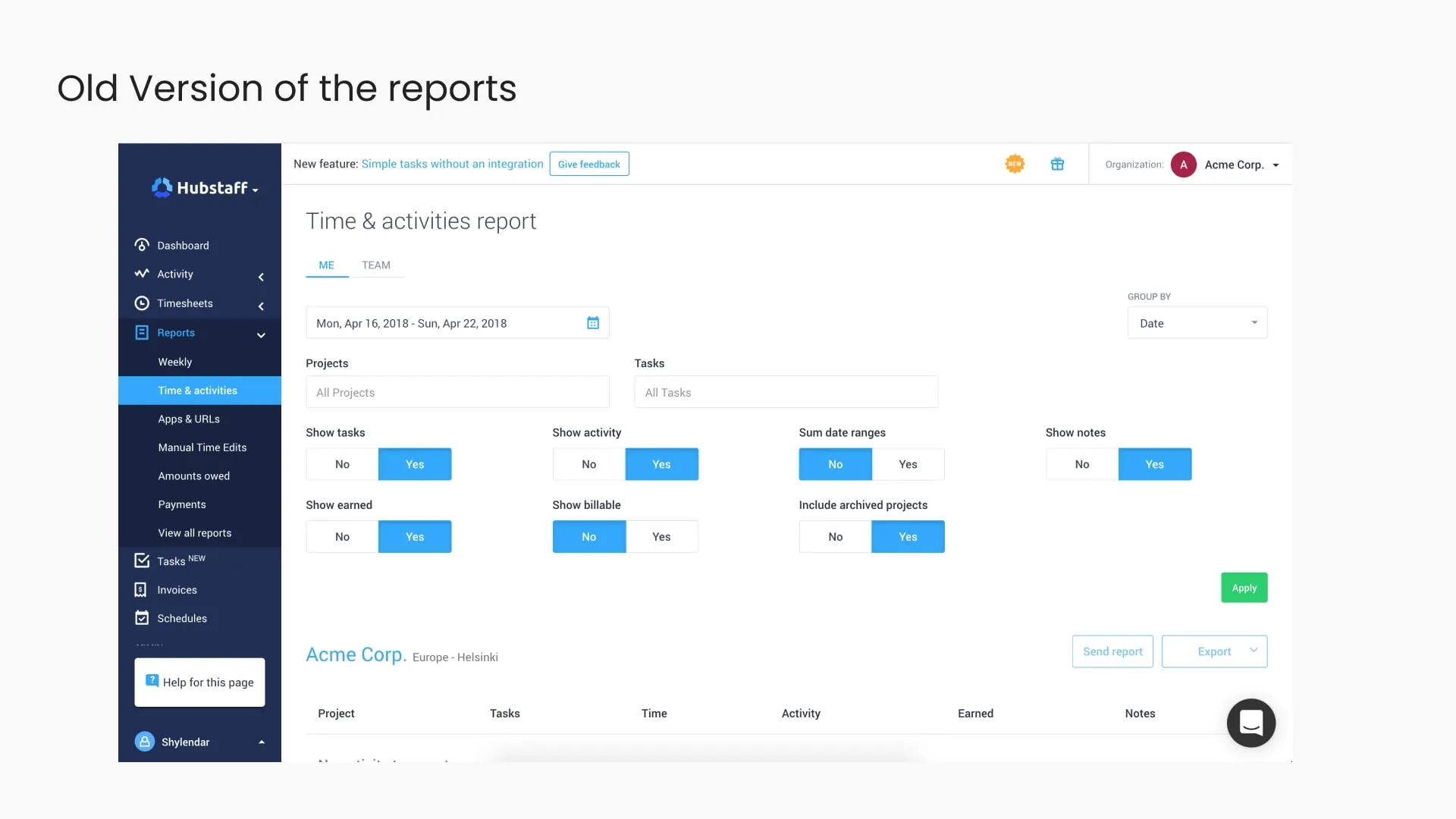
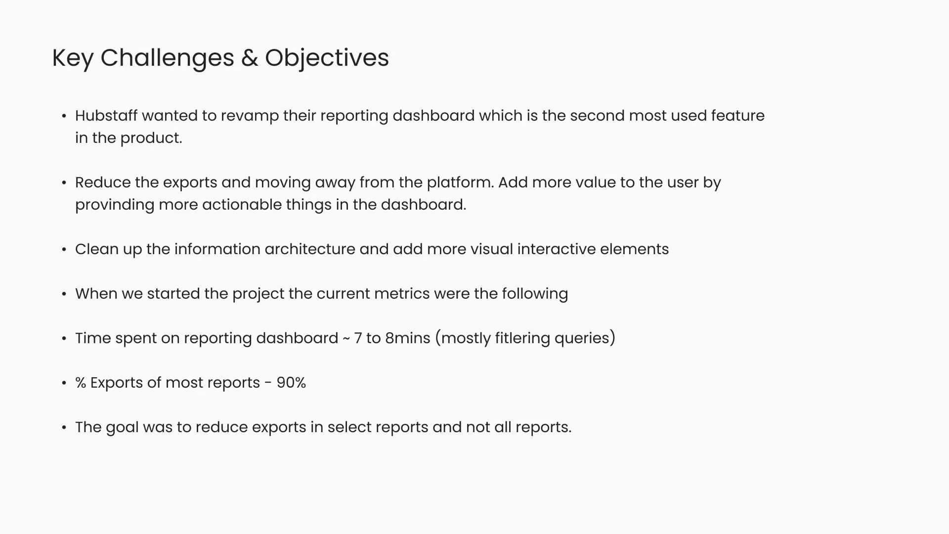
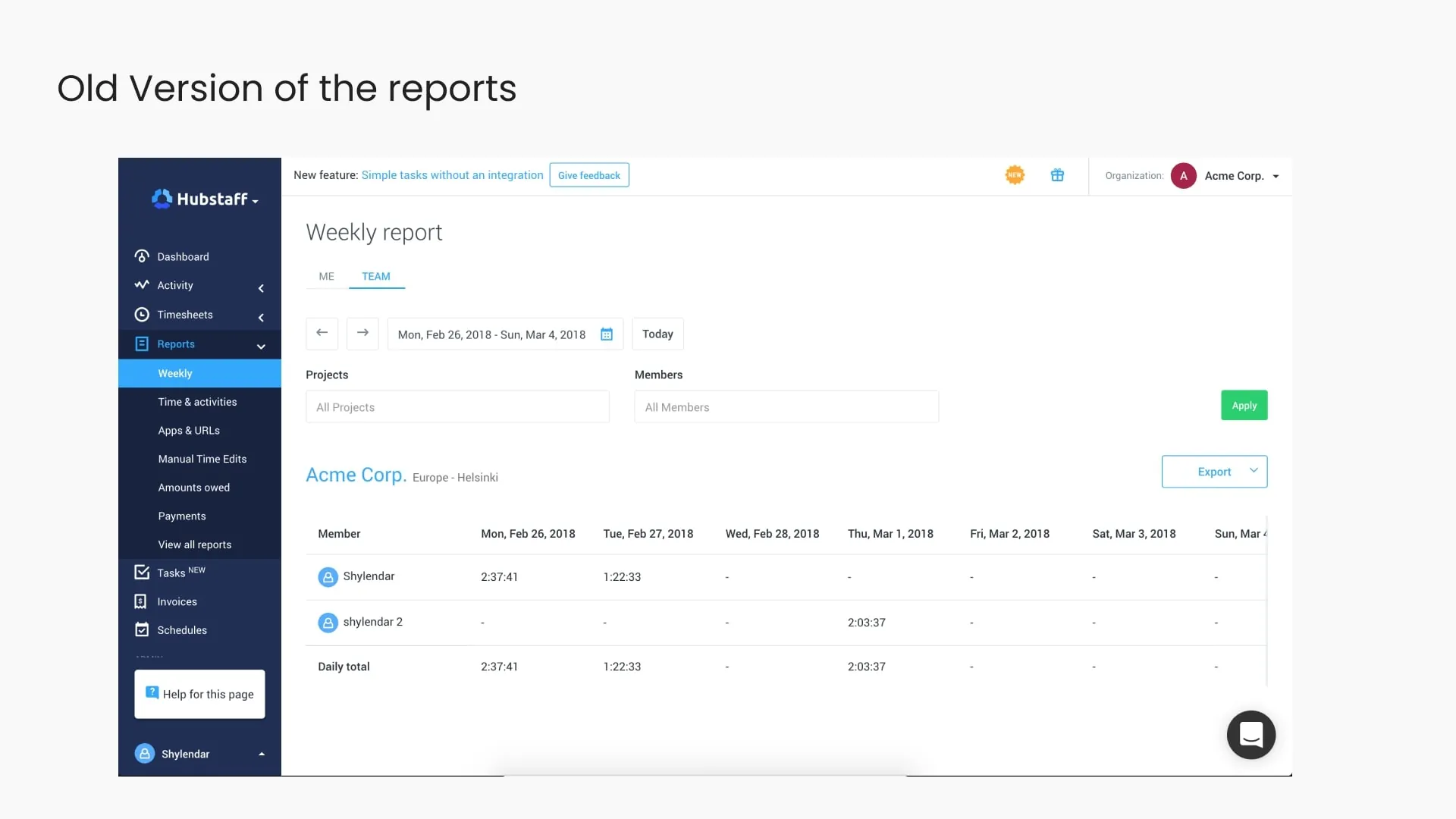
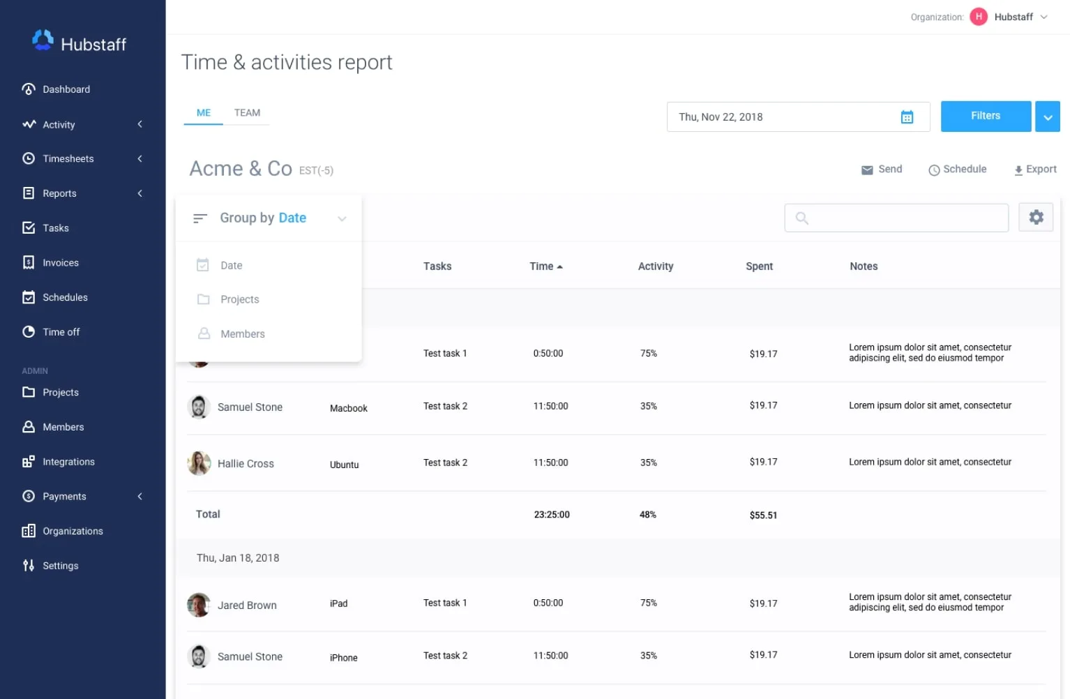
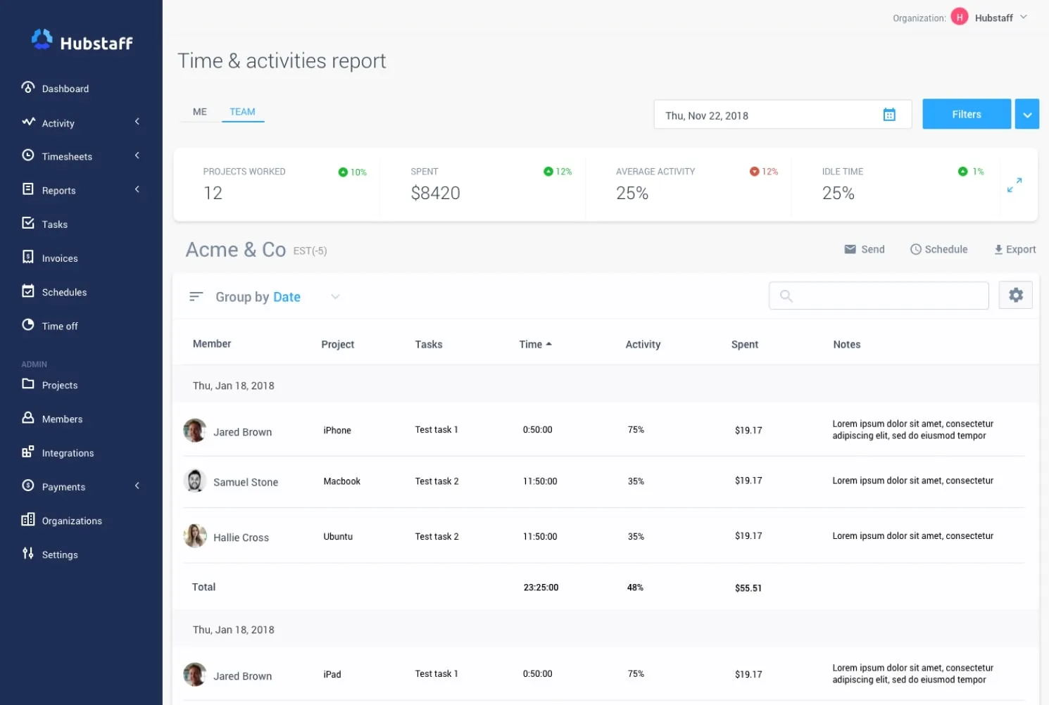
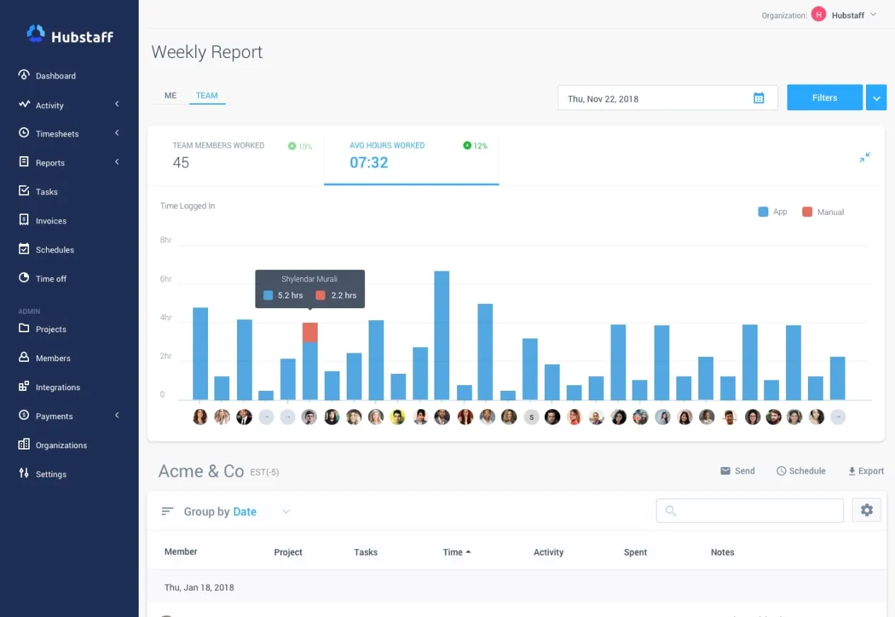
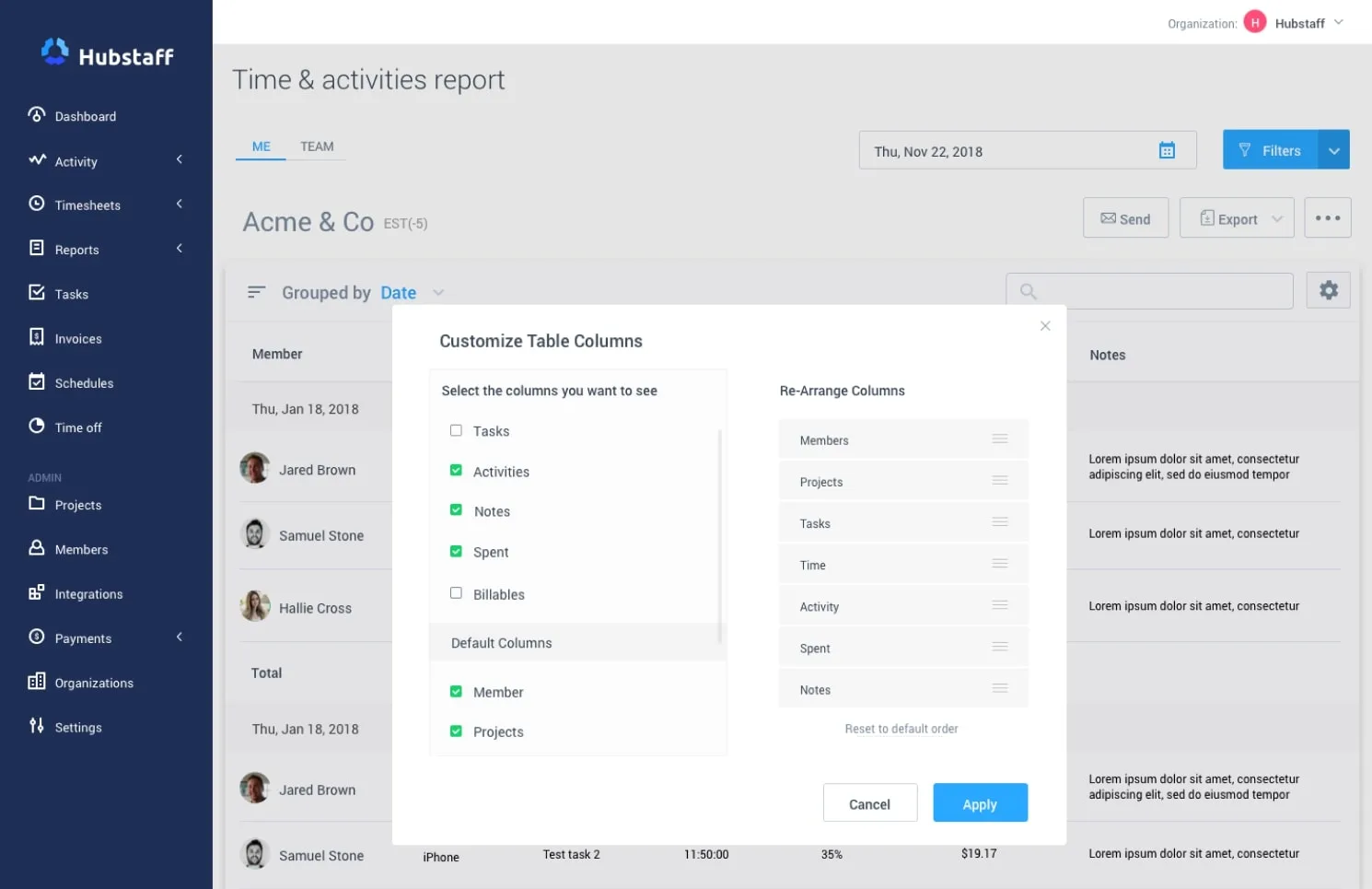
Reports redesign. Multiple report views covering time tracking, productivity, payroll, and project budgets. The design challenge was making reports that non-finance people could read and act on, not just export to a spreadsheet.
Hubstaff’s users range from small remote teams to enterprises with complex project billing structures. The reports had to serve both: filterable enough for power users, readable enough for the manager who opens it once a week.